How Do You Combine Different 2D and 3D Data Types Into One Model?
When you have 2D data, you create 2D models, most of which we call maps. When you have 2D and 3D data, things aren’t so black and white. You face a new challenge: figuring out how to combine 2D and 3D data into a single model. The good news? It’s surprisingly easy to merge different types of data into one clear, compelling, and accurate visualization.
In Surfer, all it takes is inputting your data, building your model in 2D, and then clicking “3D View” to see it come to life in three dimensions. It’s seriously that simple—and if that’s all you needed to know, consider this mission accomplished! But here’s the thing: while combining 2D and 3D data is straightforward, deciding whether your final visualization should stay in 2D or jump into 3D is a trickier question. Let’s explore.
2D vs 3D models: Which is Better?
Both 2D and 3D visualizations have their place. Each can deliver clear, compelling, and accurate models that stakeholders will appreciate. So, saying one format is universally better than the other wouldn’t be fair. However, some situations clearly call for one over the other. Before diving into when you should use each format, let’s look at what 2D and 3D models are, their unique purposes, and the pros and cons of each.
What are 2D vs 3D Models?
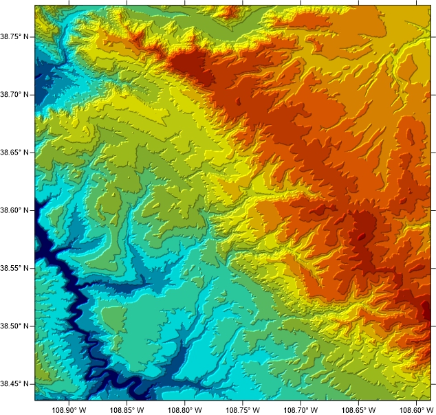
2D models are flat, with only height and width—think building blueprints, road maps, or contour lines showing elevation. These traditional maps are versatile and widely used for visualizing surface-level data.
3D models, on the other hand, add depth to the mix. With advancements in technology, they’ve become increasingly popular for providing a more detailed and realistic view of both the surface and subsurface.
Pros and Cons of 2D Models
2D models have long been the go-to for data visualization, and their benefits are undeniable. Here are their top advantages:
- Simplicity: 2D models shine in their simplicity. When done right, they can be easy to interpret, even at a glance, making them great for quick, high-level overviews.
- Accessibility: Most people are familiar with 2D maps, making them universally easy to understand—especially for surface data.
- Compact Representation: 2D models can show large areas in a compact, manageable format—perfect for print materials or smaller screens where space is limited but detail is still important.
Even though they’re beneficial, 2D models aren’t without limitations. The main cons of using them are the following:
- Lack of Depth Information: Without a third dimension, 2D maps fall short in representing elevation or depth accurately. This can be a limitation in topographic studies, geoscience, and urban planning where height or depth is crucial.
- Distortion of Scale and Shape: Flattening a 3D globe into a 2D map always leads to some distortion. For instance, projections like Mercator can make landmasses near the poles appear larger than they are, skewing perception of size and shape.
- Decreased Engagement: 2D visuals can lack immersive appeal. Because they’re flat, it’s harder for stakeholders to interact and engage with the model, which can hinder decision-making.
- Reduced Detail for Complex Structures: For intricate landscapes, building layouts, and terrains, 2D maps can fail to showcase spatial relationships fully. A 3D view is often more effective for understanding such complexities.
In short, 2D models are great for simplicity and accessibility but fall short when depth, detail, or engagement is crucial.
Pros and Cons of 3D Models
3D models bring their own advantages to the table. Here are the primary pros for using them:
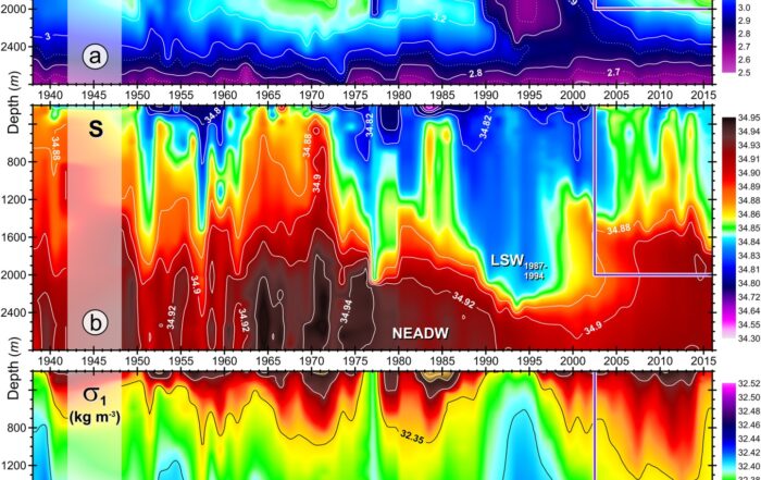
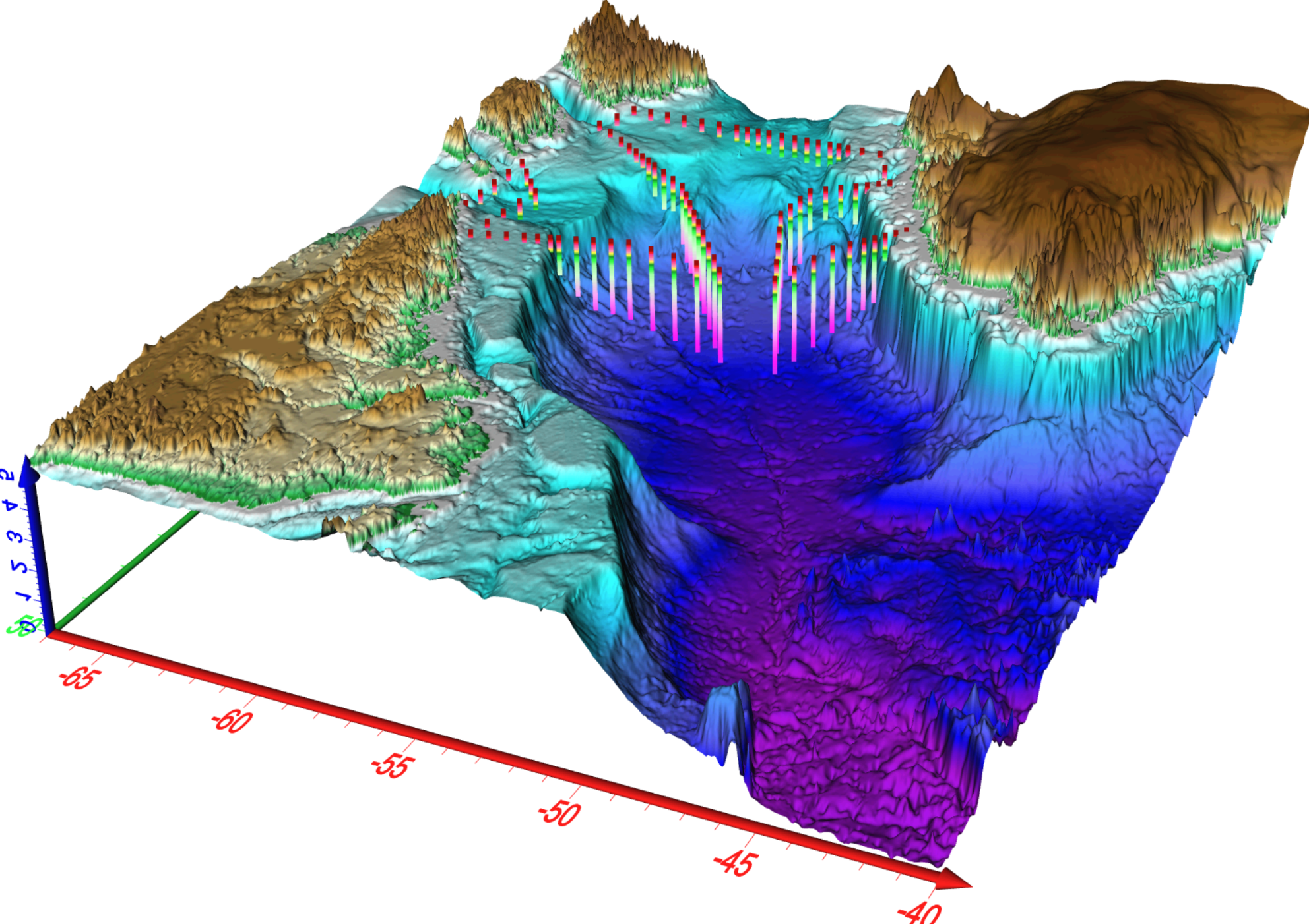
- Depth and Detail: 3D models offer a deeper and more detailed look at data, capturing depth and elevation levels that 2D can’t. This added dimension is crucial in geology, where understanding spatial relationships—like the layering of rock formations—is essential for accurate analysis.
- Interactivity: A big advantage of 3D models is interactivity. You can rotate, zoom, and view models from multiple angles, making it easier to analyze and showcase structures, which can boost engagement and deepen stakeholders’ understanding.
- Realism: 3D visualization brings data to life, offering a realistic view that’s especially useful for stakeholders who need to relate to data to take action.
- Complex Data Representation: When dealing with intricate data—such as lithology, geological formations, or seismic activity—3D visualizations provide a clear way to explore complex spatial relationships. These models make it easier to convey insights or map intricate terrain features in ways 2D can’t fully capture.
Despite their benefits, 3D models aren’t perfect. Here are a few cons to building them:
- Complexity: Depending on the data visualization software you use, developing 3D models can be time-consuming and challenging, even requiring specialized skills or a high-end computer.
- Limited Value in Some Situations: For tasks that don’t require elevation data or a third dimension (like simple navigation), 3D models may deliver unnecessary complexity without added value.
- Cost: If you’re using software that requires you to pay for advanced features, creating 3D models can be costly. That’s not ideal whether you’re a consultant running your own business or an employed geoscientist whose reputation can take a hit if the big bucks you want to spend don’t produce an ROI.
All in all, 3D models are perfect when you want to showcase depth, detail, elevation, and a realistic image. However, with the wrong software, building 3D models may slow down your workflow, add unnecessary complexity, and put your reputation on the line.
How to Tell Which Visualization is Best
Now, let’s tackle the bigger question: after combining your 2D and 3D data into one model, how do you decide whether the final visualization should be 2D or 3D? One way is to simply compare how your data looks in each format and choose the one that’s more visually appealing. But here’s the twist—there are plenty of situations where both formats look equally impressive. Consider these examples:
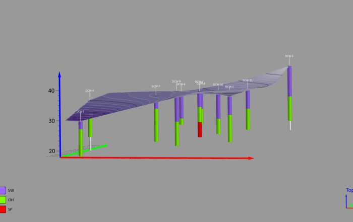
- If you’re working with 2D data and 3D data on buildings, roads, or drillholes, you can create a polished and effective model in either format.
- If you have 2D data and a 3D grid—like one showing concentrations of a substance—you can display it beautifully in both 2D and 3D as well.
When both options look great, how do you choose? That’s where a more intentional approach comes into play. Keeping the pros and cons of each model in mind, focus on what really matters: the communication format.
If your goal is to create a visualization for a paper in a publication or a written progress or final report, a 2D model is the way to go. Its simplicity, accessibility, and compact design make it ideal for communicating information clearly and effectively in these static formats.
On the other hand, if you’re giving a presentation where you can embed a video, or delivering insights during a video conference where you can share your screen, a 3D model is your best bet. Its realistic, immersive design equips you to showcase subsurface details and towering surface features in a way that’s easy to grasp—whether presenting in person or online—captivating stakeholders and driving faster decision-making. With this type of model, you can even share it as a 3D PDF, equipping stakeholders to interact with it directly, further enhancing communication and outcomes.
Clarify Your Goal
Ultimately, combining different types of data into one model is easy (at least when you’re using Surfer). The real challenge is deciding whether to keep your visualization in 2D or take it into the third dimension. The right choice will boil down to understanding what you need to achieve with your data—and tailoring your visual to fit that purpose. So take time to clarify your goals so that your decision becomes much simpler.
Ready to combine 2D and 3D data effortlessly and create stunning models? Download a 14-day free trial of Surfer to get started.