The Good, the Bad, and the Blurry: How Satellite Imagery Can Make or Break Your Maps
Context is a key element in any well-designed map. You can provide it using legends, labels, and scales – but nothing brings a map to life quite like imagery. As high-resolution data becomes more accessible, satellite imagery rises as the irreplaceable asset for adding that extra layer of context. But, is it always the hero we think it is? Let’s dive in and find out.
What Satellite Imagery Can Do for Your Maps
Depending on the information you’re sharing with stakeholders, satellite imagery can serve several purposes:
- Ensure Accurate Interpretation: Scale matters, and satellite imagery makes it easy to visualize the size and scope of your project area, down to the tiniest detail.
- Enhance Comparative Analysis: Want to showcase change over time? Satellite imagery is immensely beneficial for side-by-side comparisons of events like deforestation, mining, or wildfire damage.
- Increase User Engagement: Nothing grabs attention like seeing a familiar spot on a map. Labeled satellite images make data personal, connecting stakeholders to stories that hit close to home—literally.
- Improve Understanding: It’s all about showing, not just telling. Satellite images reveal what’s on the ground, making your data feel tangible and real.
Satellite imagery is undoubtedly a great tool to bring your maps to life, as it can serve multiple purposes; however, execution matters.
The Double-Edged Sword: When Satellite Imagery Does & Doesn’t Work
Like any good tool, satellite imagery has its pitfalls. Use it right, and it’s your map’s foundation for success. Use it wrong, and it doesn’t always deliver the desired results. Let’s look at some examples where satellite imagery both succeeded and fell short.
Example 1: Ensure Accurate Interpretation
Event: Growth and Development in the Denver Metro area
Success: Denver’s booming population has helped spur a wave of construction, and this satellite imagery from Google Maps captures that transformation perfectly. It shows the buzz of construction, illustrating sprawling new neighborhoods and development projects popping up in multiple areas. The real win here? This satellite image is fresh and up-to-date, giving viewers a peek into how the Denver metro area is expanding to keep pace with its ever-growing population. If it were outdated, accurate interpretation wouldn’t be possible.
Imagine you’re a hydrogeologist assessing water availability and quality for a multi-year study in the Denver metro area. To keep up with the rapid growth, you need the latest satellite imagery to match your data and clearly convey the shifting landscape. Delivering critical reports with outdated images? That’s a recipe for fostering misinterpretations among decision-makers and muddling their understanding of the water challenges ahead. Fresh imagery keeps your analysis and interpretation razor-sharp, supporting smart, data-driven decisions that can shape the future.
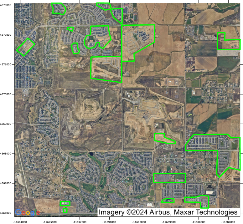
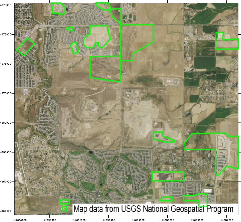
Failure: By contrast, this image from the National Agriculture Imagery Program misses the mark. While it covers the same area, it fails to show the newly built neighborhoods and ongoing construction. The outdated snapshot offers a static view that doesn’t capture the dynamic growth happening on the ground. For a hydrogeologist tracking water resources in an ever-changing metro area and reporting insights to stakeholders, outdated imagery could easily lead to misinterpretations, undermining everyone’s ability to make informed decisions about water availability and quality.
Example 2: Facilitate Comparative Analysis
Event: Hurricane Ian’s Impact on Fort Myers, Florida
Success: Pre- and post-hurricane imagery like this tells a powerful story. Before Hurricane Ian, Fort Myers was vibrant and intact. After the storm, it’s a completely different scene – especially for those living in mobile homes, where the changes are most dramatic. This side-by-side comparison speaks volumes about the storm’s impact without uttering a single word. If you’re an environmental consultant helping Fort Myers’ secure federal funding to rebuild, this pre- and post-hurricane satellite imagery is a powerful way to show decision-makers the destruction and prove the need for financial assistance.
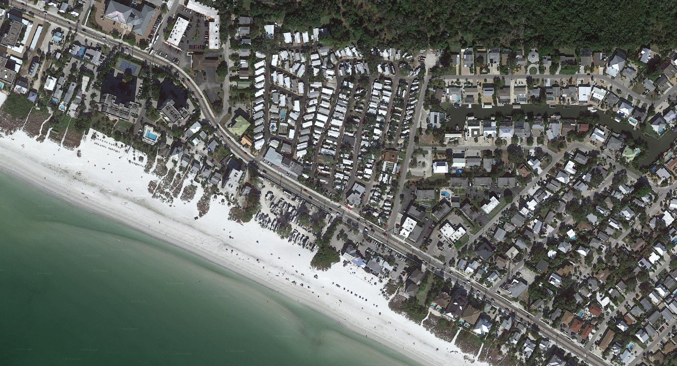
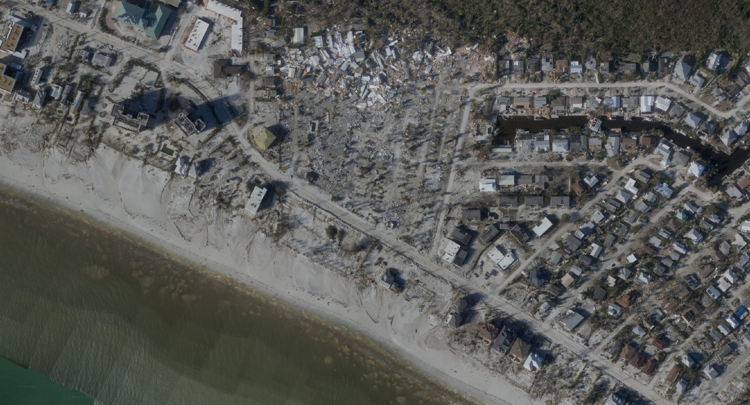
Failure: This satellite image only shows the aftermath of Hurricane Ian, and while it’s dramatic, it lacks the context of what Fort Myers looked like before the storm. It’s like watching the sequel without ever seeing the original – you get the disaster, but not the full story. Without the “before” shot, stakeholders can’t fully grasp the extent of the changes, leaving them with more questions than answers. If you’re helping Fort Myers secure federal funding, you’ll need to spend significant time explaining the storm’s damage to paint a pre-hurricane picture for key authorities. That’s time residents don’t have when they’re at square one in rebuilding their lives.
Example 3: Increase User Engagement
Event: BP Oil Spill
Success: This time-lapse with satellite imagery is like having a front-row seat to the BP oil spill. It doesn’t just mark the spot where the spill started; it tracks the spread and movement of the contamination like a detective following clues. With this visualization, you can show precisely where the oil is impacting the Gulf of Florida, grabbing the attention of stakeholders right when it counts. Also, as the time-lapse reveals the decline of the spill, it naturally prompts the big question: have the clean-up efforts worked? If you’re an environmental scientist keeping tabs on this crisis, using a time-lapse with satellite imagery to complement your data-driven story isn’t just helpful – it’s your perfect way for making or breaking clean-up initiatives.
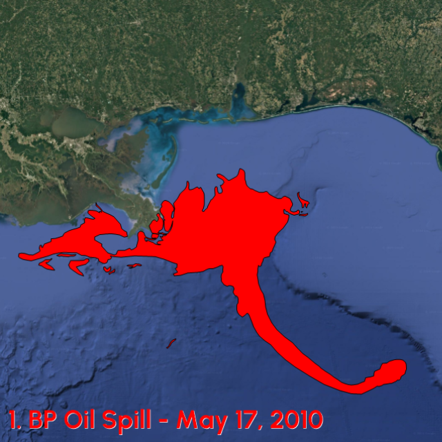
Failure: This static satellite image? Sure, it shows the BP oil spill’s location at one moment, but that’s about all it brings to the table. Will it get some engagement? Maybe. But if you’re aiming to wow stakeholders and drive quick decisions, this satellite image might leave you short. It doesn’t capture the spill’s magnitude, movement, or spread – the very things that spark urgency and action. It also fails to show the spill’s decline over time; without that, there’s little to kickstart meaningful discussions on whether the clean-up crew should go home or keep going.
Example 4: Improve Understanding
Event: The Scale and Severity of the West Virginia Drought
Success: Have you ever thought about avoiding satellite imagery entirely in favor of using another type of visual to tell your story? If not, this example will prove that some images work better than satellite images. West Virginia has been in a state of emergency since July 2024. This drought severity map vividly displays the scale of the crisis across the state’s 55 counties. Using shades of red, orange, and maroon, the map highlights the areas hit hardest by the drought, equipping stakeholders to make informed decisions.
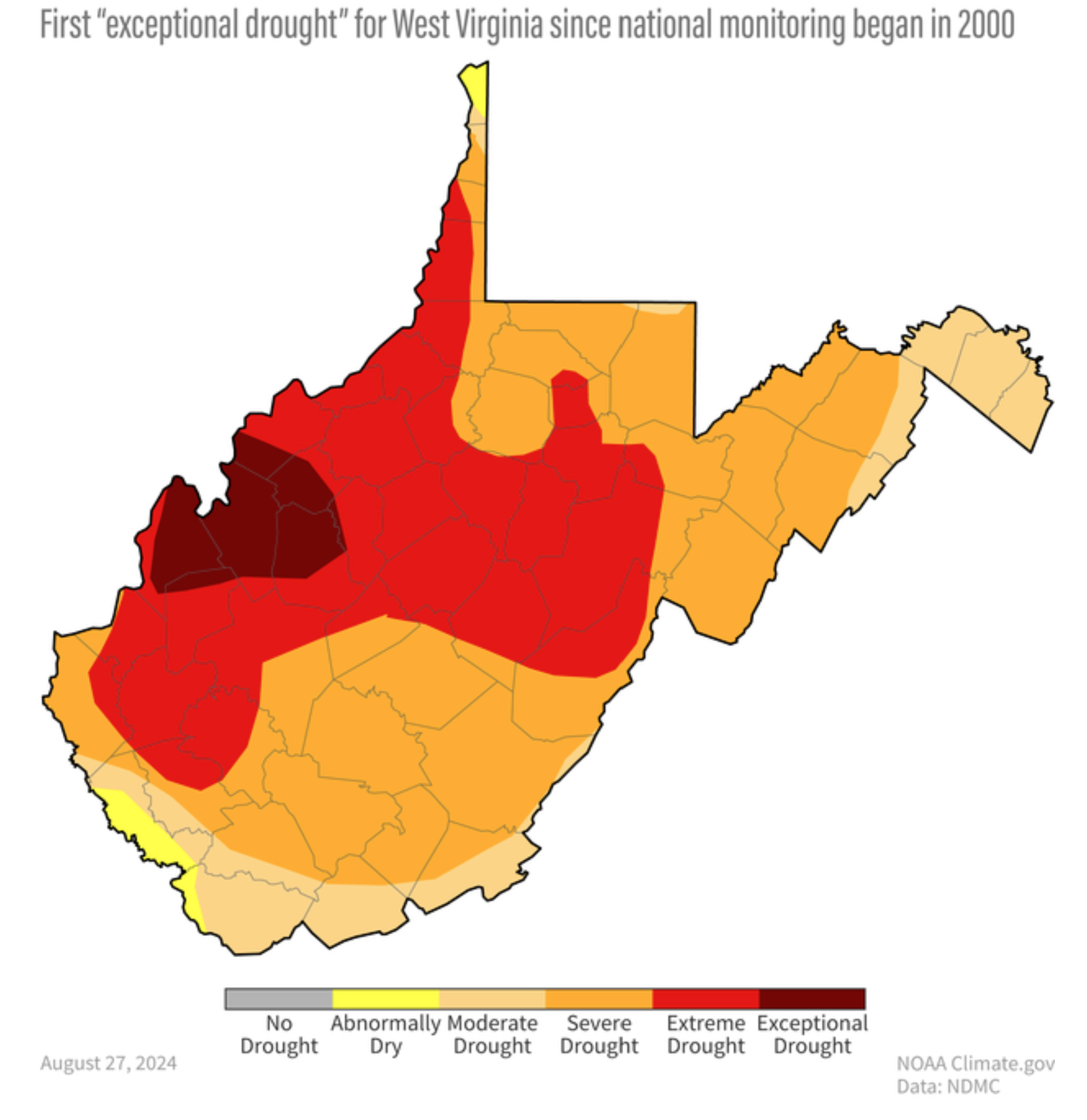
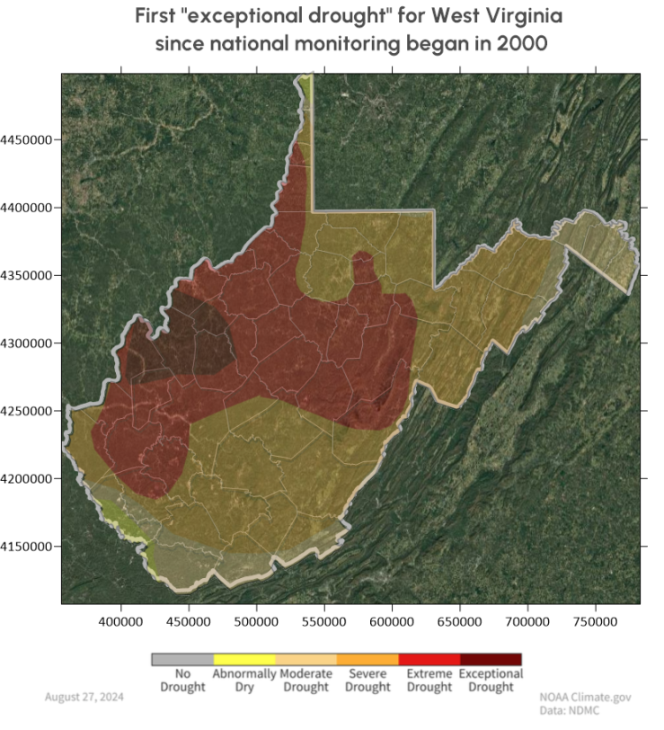
Failure: When you think of a drought, you probably imagine cracked earth and bone-dry landscapes, right? Not lush greenery. Yet, that’s exactly what this satellite image shows – a green West Virginia that looks anything but thirsty. This is misleading and a stark contrast to the critical conditions highlighted in the drought severity map. With this satellite image, there’s no way to understand West Virginia is grappling with its first Exceptional Drought in history. If you used this visual in a meeting with stakeholders, it would detract from the story you’re telling about the severity of West Virginia’s dry spell.
(Disclaimer: This example isn’t to say that satellite imagery can’t improve understanding. It certainly can in specific situations, as proven by various examples, such as deforestation in the Amazon Rainforest. However, we didn’t want to end this article without emphasizing that satellite imagery isn’t always the hero we think and should be reconsidered in some cases so that it doesn’t hurt your story.)
The Bottom Line: Make Your Maps Matter
Surfer now equips you to add XYZ Tiles servers to access a wide variety of high-quality, global imagery so that your maps don’t just inform – they captivate. For insight on how to access the latest XYZ Tiles servers in Surfer, read our how-to article for details. Trust us. You won’t regret it. With stunning visuals at your fingertips, your maps will tell the story you want in a way that sticks with decision-makers long after they’ve looked away.
About Sheena

Sheena Skinner joined Golden Software as a Product Manager in January 2023, and works with the Product Team on Surfer and Grapher. Sheena attended Red Rocks Community College and CU Boulder, graduating with degrees in Geology (with a focus in Geochemistry and GIS). She spent her early career working in geochemistry labs, and has since transitioned into technical project management related to 3D geospatial products. Her professional interests include managing software products/projects, promoting innovation and inspiration among her colleagues, and learning the capabilities and shortcomings of software products to make them more efficient and user-friendly.
Sheena’s personal interests include exploring the mountains with her partner and their two dogs, as well as collecting rocks literally everywhere she goes. She is an avid reader of science fiction and a movie connoisseur. Sheena is also very passionate about academic outreach, as well as general volunteer work. She spends her free time inspiring middle school and high school aged students with her passion and love for science and continuing education. She also regularly volunteers with several non-profits in the Greater Denver Area.
