Webinar Recap: Utilizing Map Elements for Professional, Consistent Final Outputs
Stakeholders rely on clear, well-organized visualizations to make informed decisions, and ensuring your maps have critical elements that can enhance readability, consistency, and professionalism will help them make those informed decisions. That’s exactly what we covered in our recent Utilizing Map Elements webinar.
In this session, our Surfer Expert and Senior Business Development Manager Drew Dudley walked through best practices for using key map elements to create stunning, clear, and professional maps for stakeholders. If you missed it, don’t worry—this recap covers the main takeaways, and you can watch the full webinar here for more details.
Why Map Elements Matter
Before diving into the takeaways from the webinar, let’s set the stage. A great visualization isn’t just about the data. It’s about how that data is presented. Maps without certain elements—like clear labels, legends, scale bars, north arrows, grid lines, or frame templates—can confuse rather than clarify, leading to unproductive communication among stakeholders and little action. On top of that, they can lack a consistent and professional look, decreasing credibility in front of stakeholders who are part of regulatory agencies that require maps in specific formats.
Your visualizations must be top-notch to equip decision-makers. That means you need to include essential map elements to help your visualizations stand out, resonate with viewers, and align with industry standards. It doesn’t matter if you’re working on environmental reports, site plans, or geophysical surveys. Adding essential map elements will help you and stakeholders significantly in moving in a positive direction.
Key Takeaways from the Webinar
It’s time to walk through the main takeaway from the webinar. Here are the key points Drew covered to help attendees efficiently add critical map elements in Surfer to create high-quality final outputs.
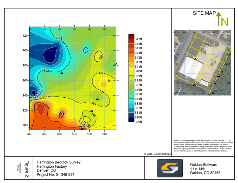
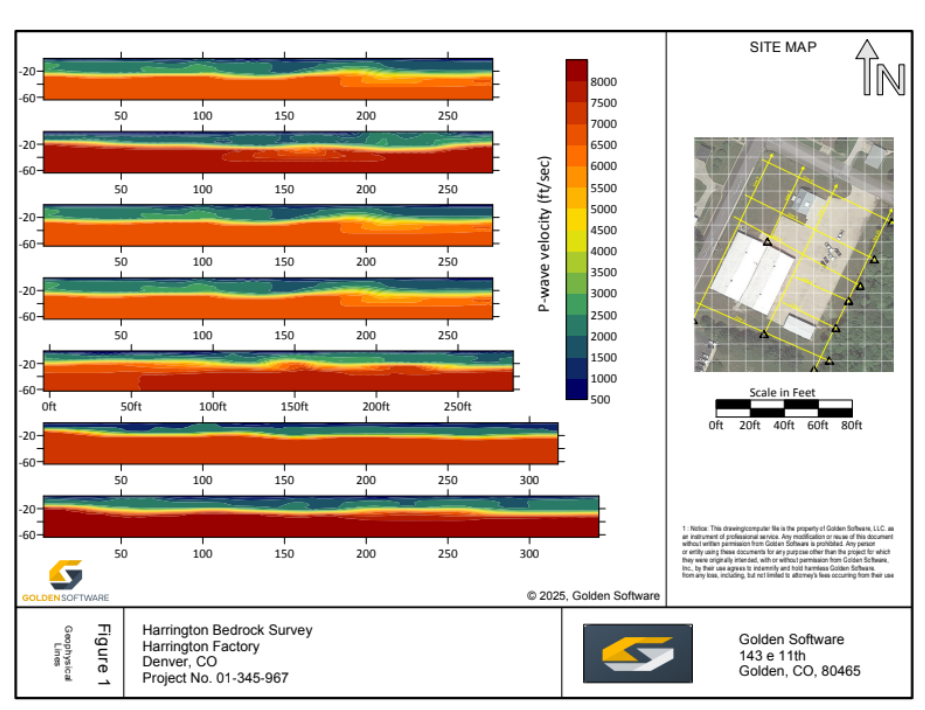
1. Using Frame Templates for Consistency
- Frame templates provide a structured, professional layout for reports.
- Surfer includes ready-to-use frame templates that can be applied with just a few clicks.
- Users can customize frame templates by adjusting titles, adding company logos, and modifying text elements.
- Including company information and design elements to frame templates reinforces branding and professionalism.
2. Essential Map Elements to Include
- Graticules & Gridlines are great for improving spatial reference and only require overlaying coordinate grids.
- North Arrows clearly indicate orientation and can be customized to match project aesthetics.
- Scale Bars ensure accurate distance representation—you can also include labels for added clarity.
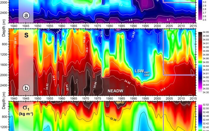
- Legends & Color Scales are key to helping stakeholders interpret mapped data, especially for contour maps or cross sections.
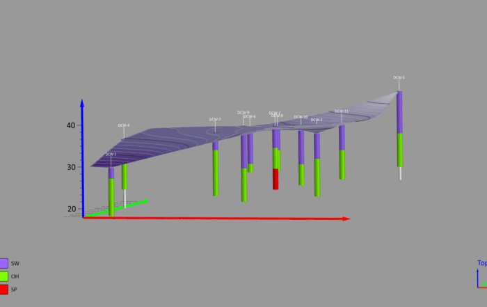
3. Aligning and Organizing Multiple Maps
- Effectively organizing multiple maps from a project onto a single page equips stakeholders to see the full picture in one clean place.
- Aligning cross sections across a page ensures consistent X-scale values, making comparisons easier.
- Layout tools in Surfer allow for precise alignment and spacing of elements so everything looks clean and professional.
4. Exporting the Final Output
- Surfer’s vector PDF export creates crisp, high-resolution files ideal for reports.
- Alternative formats, such as JPEG and TIFF, are available for different project needs.
- Saving a project as a template allows for easy duplication when multiple figures are required.
Watch the Full Webinar for Step-by-Step Instructions
The recent webinar was packed with practical demonstrations, showing exactly how to apply essential map elements in Surfer to create polished, professional visualizations for stakeholders. So if you missed the live session or want to revisit specific steps, watch the full webinar recording. By incorporating strategies into your workflow to enhance your maps, you will elevate your final outputs to ensure stakeholders make the best decisions.