Key Takeaways from Storytelling with Data (Pt 1): What Our Team Learned & Wants to Share
At Golden Software, we’re committed to growing and learning so we can serve you better—whether you’re a loyal customer or just exploring what we have to offer. That’s why we make professional development a priority every quarter. It’s not just a nice-to-have; it’s a must. Recent studies show that professional development opportunities boost employee engagement by 15% and increase productivity by 24%. For us, that looks like staying sharp, focused, and equipped to deliver top-notch support to help you achieve your goals.
Despite our team’s commitment to growing professionally, we don’t usually highlight our quarterly learning opportunities in content because it may not add value to your work. However, one professional development experience from 2024 is worth mentioning: Q3, when we set our sights on sharpening our data visualization skills. Why did we choose to grow in this area? Because we know that as geoscientists, your work demands visuals that are not only accurate but also clear and compelling enough to inspire action. So, to elevate our skills to better support your needs, we turned to Storytelling with Data by Cole Nussbaumer Knaflic—a powerful guide that equips readers to communicate complex data clearly and effectively.
After reading the book, we walked away with so many insights that we couldn’t keep them to ourselves. That’s why we’re kicking off a blog series titled Key Takeaways from Storytelling with Data to share the top lessons we learned. Over the next few posts, we’ll unpack tips and strategies we discovered that can help you create stunning story-driven data visualizations. We’ll specifically focus on graphs and charts since those are what the book covered. But to get the ball rolling, let’s first lay the foundation for why storytelling with data matters.
What Is Storytelling with Data?
It’s important to start with the basics: what exactly is storytelling with data? While the book by Cole Nussbaumer Knaflic brought this concept to the forefront in many circles, the term itself isn’t new. Storytelling with data—sometimes called “data storytelling” or “data-driven storytelling”—has become a buzzworthy topic in articles, videos, and discussions worldwide.
The reason for its popularity is simple: as the amount of data at our fingertips continues to grow, analyzing it isn’t enough. To make a meaningful impact, you must bridge the gap between exploratory analysis (finding the story) and explanatory analysis (communicating the story to your audience). At its core, that’s what storytelling with data helps you achieve. It’s the ability to weave engaging narratives into your data visualizations to effectively communicate insights from a dataset. By incorporating a narrative into your graphs and charts, you transform raw numbers into a clear, compelling story that resonates with stakeholders, which drives better decision-making.
Quick Recap
What Is Storytelling with Data?
Definition: Storytelling with data is the practice of transforming raw datasets into a visual narrative. It combines data visualization with narrative psychology to move an audience from simply seeing numbers to understanding insights so they can take action.
Data Visualizations That Tell a Story: What Are the Benefits?
Now, if you’re wondering whether there are research-backed benefits to incorporating stories in your data visualizations, we have good news: there are multiple. Studies suggest just how impactful storytelling can be when paired with data, especially when you compare it to standard reporting.
For starters, 55% of people agree that a compelling story keeps their attention during a presentation. That means over half of your audience is more likely to stay focused and avoid tempting distractions if your data visualization is woven into a great narrative. Even better? Research suggests that 90% of people think a strong narrative ensures engagement. So, do you want stakeholders to discuss the insights you’re sharing to foster good decision-making? Including a story in your graph or chart is your best bet.
To quickly show how much storytelling with data changes things, here’s a brief look at how it differs from standard reporting to bring benefits.
| Feature | Standard Data Reporting | Storytelling with Data |
|---|---|---|
| Goal | To present information | To inspire a specific action |
| Design | Default settings | Intentional use of color, font, and other design elements |
| Narrative | None: the data speaks for itself | Guided: the visual tells the story |
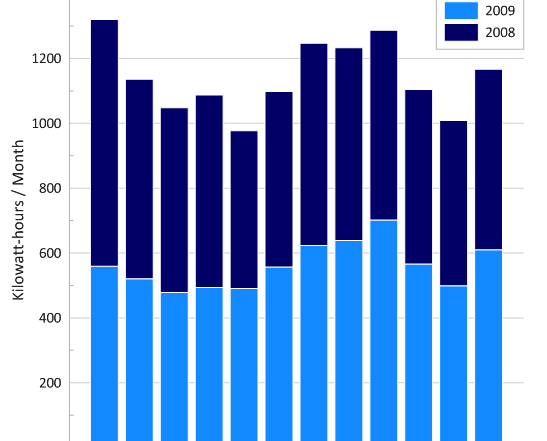
| Clutter | Gridlines, legends, and border | Minimalist, focused on key data |
Why Is Storytelling Important in Data? Unpacking the Psychology.
To give greater context on why storytelling with data is so powerful, we also have to look at how the human brain processes information.There are a couple of things to keep in mind here.
The Retention Factor: Jerome Bruner’s 22x Rule
Perhaps the most compelling reason to incorporate narratives comes from cognitive psychologist Jerome Bruner. According to his research, people are 22 times more likely to remember a fact when it’s delivered as part of a story. When we present raw data, only the language processing parts of the brain are activated; but a story engages multiple sensory areas, making your message truly unforgettable.
The Focus Factor: How Narratives Fight Distraction
Including a story in your graph or chart is also your best bet for managing cognitive load. By using a narrative to guide the viewer, you tell them exactly where to look. This prevents “information overload” and ensures stakeholders focus on the actionable insights that matter, rather than getting lost in the “noise” of a complex dataset.
Key Takeaways to Share the Story In Your Data
Now, for the fun part. What are the key takeaways we took from Storytelling with Data and plan to share in our blog series? Here’s a sneak peek at the insights we’ll be covering to help you craft data visualizations with great narratives:
- Selecting the Right Visualization: Not all visuals are created equal. Choosing the right graph or chart can make all the difference in how effectively you communicate insights.
- De-Cluttering Using Gestalt Principles: A cluttered data visualization can confuse more than it clarifies. Luckily, Gestalt Principles can help you remove unnecessary elements and create cleaner, more focused graphs and charts.
- Grabbing Attention with Pre-Attentive Design: To make your data visualizations stand out and attract attention, you need to design for quick comprehension and engagement. Pre-attentive attributes—like color, size, and position—can draw your audience’s focus to the most critical parts of your data story.
- Communicating Data Using Smart Design Choices: Knowing stakeholders will make decisions based on your data visualization is one thing. Designing your data visualization to help them make decisions effectively is another thing entirely. You need to implement smart design choices that go beyond the basics to ensure your audience gets what they need to take steps forward.
All of these techniques can help you turn data into compelling, actionable stories that stakeholders enjoy and use to make great decisions. But there’s a lot to unpack with each takeaway if you want to implement them effectively, so we’ll dedicate an article to each tip to ensure you have everything you need to design graphs and charts that wow decision-makers.

Create Story-Driven Data Visualizations
Data storytelling is a popular topic for good reason, and we look forward to diving deeper into it with you. Our goal is to share insights we discovered that will help you transform the way you create graphs and charts, so follow along with our Series Directory below to master each step of the process.
Storytelling with Data: The Full Series
- Part 1: Key Takeaways from Storytelling with Data (you are here)
- Part 2: How to Pick the Right Type of Data Visualization
- Part 3: How to De-Clutter Your Data Visualization
- Part 4: How to Capture and Guide Stakeholders’ Attention
- Part 5: How to Think Like a Designer
We’re excited to continue this journey with you!