Key Takeaways from Storytelling with Data (Pt 4): How to Capture and Guide Stakeholders’ Attention
Every good story has one thing in common: it grabs your attention and keeps you hooked. Whether it’s a gripping novel or a compelling movie, the ability to capture and guide your audience’s focus is what makes the narrative truly effective—and your data visualization’s story should do the exact same thing.
Your graph or chart isn’t just a static image; it’s the main vehicle for the story you’re telling. It should reel stakeholders in, direct their gaze to the most important insights, and guide them seamlessly through your narrative. But how do you ensure your data visualization’s story captures attention and keeps it? In this next installment of our Key Takeaways from Storytelling with Data series, we’ll share how you can create graphs and charts that not only engage stakeholders but also guide their focus exactly where it needs to be, keeping them hooked from start to finish.
Why Capturing and Guiding Attention Matters
Why is it important to engage stakeholders? You need to capture and maintain their attention for one simple reason: people’s attention spans are short. In fact, science confirms what many of us have experienced during presentations—audiences that lose focus faster than expected.
Take, for instance, a recent study from Finland that monitored attention during virtual meetings. Using heart rate devices to measure engagement, researchers found that many participants felt drowsy, with some nearly dozing off, in as little as 10 minutes. These findings weren’t just self-reported; they were backed by hard data and cross-referenced with participants’ feedback. This isn’t an isolated discovery, either.
John Medina, a biology professor at the University of Washington, runs an annual experiment with his students and consistently finds the same result: by the 10-minute mark, attention begins to plummet to near zero. Whether in the classroom, a meeting, or a stakeholder presentation, audiences are prone to tuning out unless something grabs—and keeps—their focus. This is why your data visualization’s story must do more than just inform. It needs to engage stakeholders immediately and guide their attention as you share critical insights.
Use Pre-Attentive Attributes to Capture and Guide Attention
So, how do you capture and hold your audience’s attention in a world where distractions are just a click away? Enter pre-attentive attributes—key visual features like color, size, and shape that you should include in any graph or chart. These visual properties are what our brains process almost instantly, often within milliseconds, before we consciously start analyzing what we’re seeing. Why? Because our brains are wired to notice contrasts. Differences in color, size, and position stand out against the backdrop of sameness, acting as beacons that attract and guide an audience’s eyes while a data visualization’s story is unfolding.
If you leverage these attributes effectively, you can highlight the most important parts of your graph or chart’s story to direct stakeholders’ focus exactly where it needs to go. For example, imagine a scatter plot with hundreds of data points. If you wanted decision-makers to focus on a particular trend, making those points a brighter color or larger size would immediately draw attention to them—before you even said a word. With pre-attentive attributes, you can not only capture attention but also maintain it by strategically steering stakeholders through the narrative of your visualization.
Before and After: How Pre-Attentive Attributes Transform a Visualization
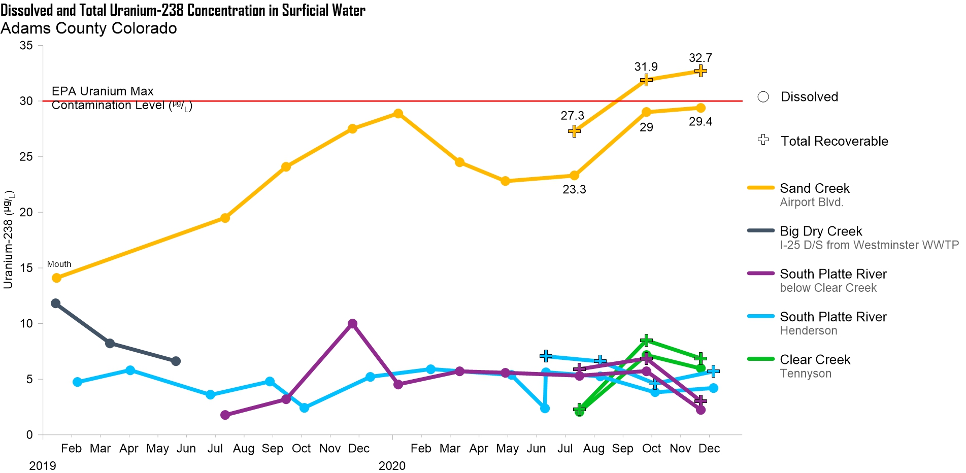
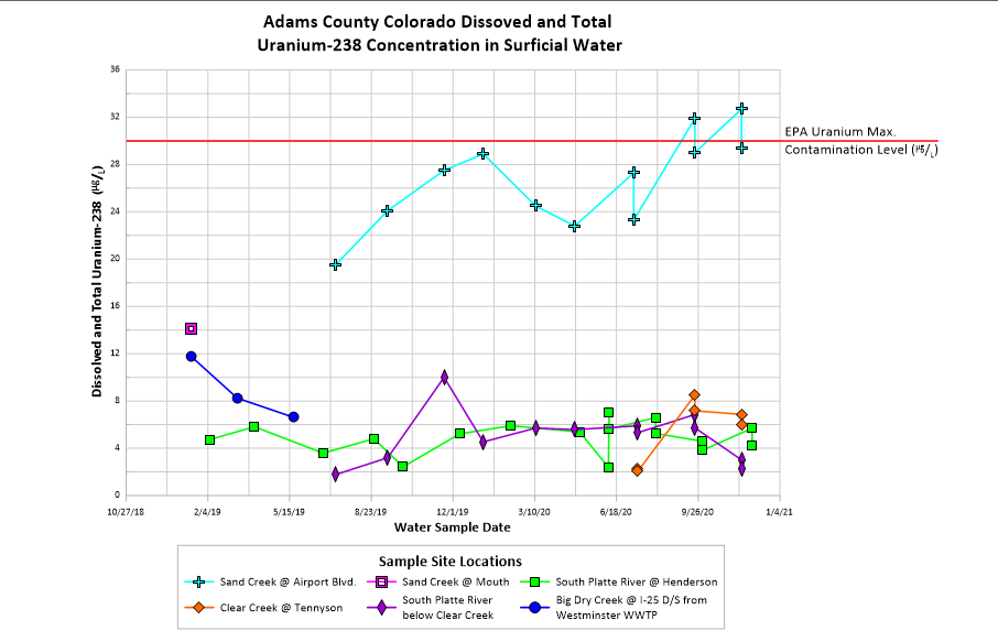
Let’s take a look at a practical example to see how pre-attentive attributes can elevate a data visualization’s story. On the left, you’ll find the “before” version of a chart showing uranium concentrations in Adams County, Colorado, while the “after” version on the right presents the same data but demonstrates how using pre-attentive attributes can make a world of difference in capturing and guiding attention throughout a narrative.
The Before: Clutter and Confusion
In the original chart, stakeholders would likely struggle to focus on the most critical insights in your story, decreasing engagement. Here’s why:
- Overwhelming Symbols: The “before” chart uses multiple shapes (diamonds, squares, plus signs, etc.) to represent different data points. This clutter makes it hard to understand what to focus on.
- Distracting Gridlines: The dense gridlines dominate the chart, competing for attention and making the data feel lost.
- Poor Data Organization: Misaligned data points and jagged lines make it unclear which data belongs together and what the story is explaining. For instance, dissolved and total concentrations appear jumbled rather than distinct.
- Hard-to-Follow Legend: The legend has a lot of text and symbols, requiring extra effort to interpret, which viewers may not want to do.
The result? A data visualization that doesn’t capture or guide attention effectively, leaving stakeholders with more questions than answers about the story you’re sharing.
The After: Clarity and Focus
Now let’s break down the “after” chart, which uses pre-attentive attributes to tell the story clearly and effectively to capture and guide stakeholders’ attention:
- Simplified Symbols: The chart uses only two symbols (circles for dissolved concentration and plus signs for total concentration), immediately clarifying the distinction between datasets so stakeholders know where to focus.
- De-cluttered Gridlines: The gridlines are toned down, giving the data itself the spotlight.
- Corrected Data Presentation: By separating datasets that were previously lumped together, the chart eliminates confusion and provides a better look at the story stakeholders should be focusing on.
- Improved Use of Color: Each data series is assigned a distinct, vibrant color that draws attention to key trends while keeping everything easy to follow.
- Polished Legend: The legend is cleaner and more intuitive, guiding viewers’ interpretation of the data without unnecessary effort.
Here’s another significant takeaway: while the “after” chart is much clearer, the real story here is about Sand Creek—the only site exceeding the EPA’s maximum contamination level. The data from other sites, though valid, isn’t completely necessary to the story being told. So, if we were to refine this data visualization even more, we’d refrain from including too much data that could dilute the message so that it’s easier to focus on what matters most.
The Lesson
This transformation shows how pre-attentive attributes like color, form, and shape can turn a confusing visualization into a compelling one that captures and guides stakeholders’ attention as the data’s story unfolds.
A Cornerstone of Data Storytelling
Attracting and guiding stakeholders’ attention is the cornerstone of effective data storytelling, and it’s never been more critical. As audiences lose focus in just minutes, it’s clear that your data visualizations need to do more than display information—they need to captivate and guide stakeholders through a clear narrative. By using pre-attentive attributes like color, size, and shape, you can ensure your visualization’s story not only holds decision-makers’ attention but also directs them to the most important insights.
In our next blog, we’ll continue diving deeper into how you can improve your data storytelling, so stay tuned to discover more tips from our Key Takeaways from Storytelling with Data series. With the tools and techniques we unpack, you’ll create graphs and charts that don’t just show data—they tell stories that stakeholders engage with and remember. Subscribe to the blog so you don’t miss out!