Mapping Insights with Color: The History, Power, & Applications of Color Relief Maps
Color relief maps have earned their place as one of the most popular tools in data visualization. With their vibrant gradients and ability to transform complex information into clear, engaging visuals, they’re a go-to choice for communicating data effectively. But how did color relief maps become such a powerful tool in data visualization, and what industries are currently utilizing them to solve complex challenges? To understand their lasting appeal, let’s dive into their fascinating history, unique advantages, and the impactful ways color relief maps are shaping the world today.
The History of Color Relief Maps: Adding Dimension with a Splash of Color
Color relief maps are the bold, artistic cousins of contour maps, turning geography into vibrant storytelling. Their origins stretch far back in time, proving that humans have always sought creative ways to capture the highs and lows of the world’s vast landscapes. The earliest attempts at relief mapping date back to ancient China during the Qin Dynasty (221–206 BCE), where sculptural models were used to depict landscapes. These physical 3D maps were a tactile way to show elevation, setting the stage for more innovative techniques to come down the road.
Fast forward a few thousand years, and the Renaissance brought new energy to cartography. European mapmakers began experimenting with shading and color to mimic the look of three-dimensional terrain. By layering lighter and darker hues, they could suggest the rise and fall of mountains and valleys, transforming flat maps into something dynamic and visually engaging. These early color techniques made maps not only functional but also works of art. However, as time went on, using color to enhance maps advanced even more.
The modern era of color relief maps took off in the 19th and 20th centuries, thanks to advancements in printing and scientific exploration. As the need for accurate topographical data grew, cartographers refined their use of color gradients to depict elevation. Green for lush valleys, yellow for rolling hills, and white for peaks became a standard palette, creating a striking and intuitive way to interpret terrain at a glance.
The Benefits of Color Relief Maps: Where Art Meets Utility
The journey of color relief maps — from ancient sculptural models to critical modern data visualization tools — shows just how powerful they’ve become. But their unique history only scratches the surface. What really sets these visualizations apart as go-to tools are the tangible benefits they bring to the table. Here are just some of the big advantages color relief maps offer.
Improved Clarity
With their vibrant gradients, color relief maps make complex data easy to understand at a glance. By assigning colors to specific elevation ranges or continuous data values, these maps highlight patterns and trends that might otherwise go unnoticed. Whether it’s identifying a watershed’s boundaries or pinpointing high-altitude regions, color relief maps provide immediate clarity for stakeholders to act on.
Enhanced Decision-Making
Color relief maps excel at turning raw numbers into actionable insights, fostering quicker and more informed decision-making. For example, they can reveal flood-prone areas, optimal routes for infrastructure, or regions most suitable for agriculture—all in one cohesive image. When the stakes are high, these visualizations simplify the decision-making process by presenting data in an intuitive, digestible format.
Visual Impact
Without a doubt, color relief maps are some of the most eye-catching visualizations, especially when done well. Their ability to turn data into art makes them ideal for presentations, reports, or any situation where it’s critical to grab attention. Stakeholders are far more likely to engage with a visualization that’s not only informative but also visually captivating, and these maps ensure messages don’t just land but resonate.
Layered Insights
Color relief maps shine when used alongside other data layers. By overlaying features like roads, vegetation, or population density, it’s easier to create a multidimensional view of the area stakeholders want to assess. This opportunity to combine datasets can enrich a map’s narrative, helping communicate complex ideas with clarity and precision.
Industries Utilizing the Power of Color Relief Maps
With benefits like improved clarity, enhanced decision-making, striking visual impact, and the opportunity to layer complex insights, it’s no wonder color relief maps have become indispensable tools across numerous industries. These visualizations are helping scientists like you and other professionals transform data into actionable insights that stakeholders can interpret and use to solve problems. As proof, here are several fields where color reliefs maps are making a difference.
1. Archaeology
Archaeologists rely on color relief maps to showcase hidden historical treasures. For example, a map of an ancient settlement site might include color gradients to highlight subtle elevation changes that indicate buried structures or pathways. These insights guide excavation efforts while preserving the integrity of the surrounding landscape.
2. Urban Planning
When building infrastructure, color relief maps provide urban planners with critical elevation data to design stable foundations. For example, planners designing a new highway can analyze a color relief map to identify the best routes, avoiding areas with too much uneven terrain or finding creative solutions to build in unique environments. This analysis prevents costly redesigns and ensures a project aligns with the landscape.
3. Geology and Mining
Color relief maps are invaluable in geology and mining, where understanding terrain and subsurface structures are essential. Geologists, for instance, use these maps to visualize mineral-rich zones by layering elevation data with seismic readings. With this type of visualization, mining operations are significantly more efficient, as they minimize wasted efforts and environmental disruption.
4. Environmental Science
Environmental scientists use color relief maps to model natural processes like erosion or water movement across a landscape. Take flood management, for example: a color relief map can highlight how rainfall flows across varied terrain, pinpointing areas vulnerable to runoff or pooling. When showcasing these insights, environmental scientists help stakeholders identify and mitigate risks while ensuring sustainable resource management in vulnerable ecosystems.
5. Disaster Management
When it comes to preparing for natural disasters, color relief maps are lifesavers—literally. Emergency planners use these maps to identify landslide-prone areas after heavy rainfall, based on terrain slope and soil saturation data. This information helps allocate resources efficiently and plan evacuations, reducing risks for affected communities.
6. Hydrology and Water Resources
Color relief maps bring water movement to life, helping hydrologists plan flood mitigation and water resource management. For example, a watershed model displayed on a color relief map can show how rainwater travels to a reservoir, highlighting areas where retention ponds or levees are needed. These insights can ensure water resources are used effectively while protecting nearby communities from flooding.
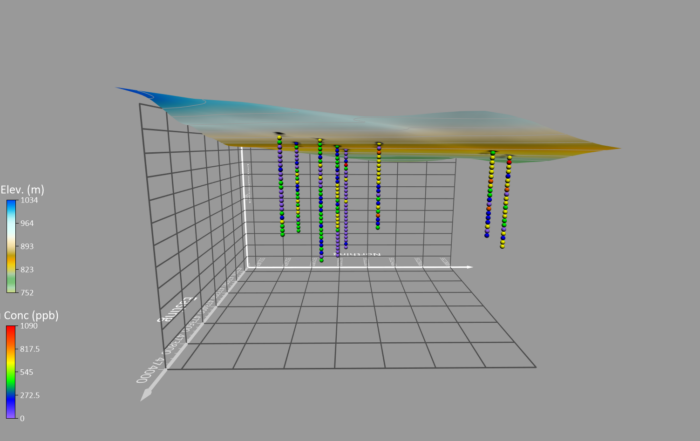
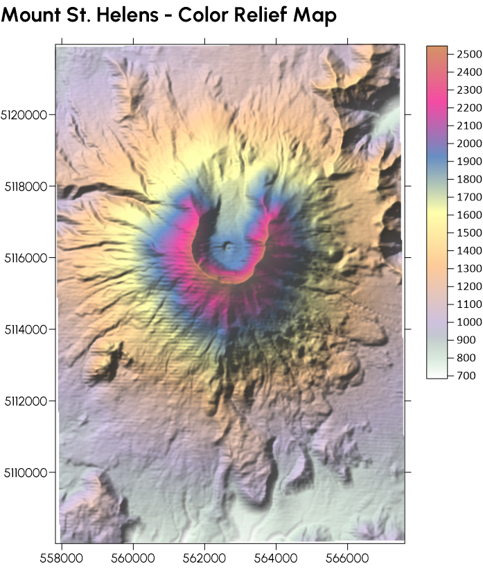
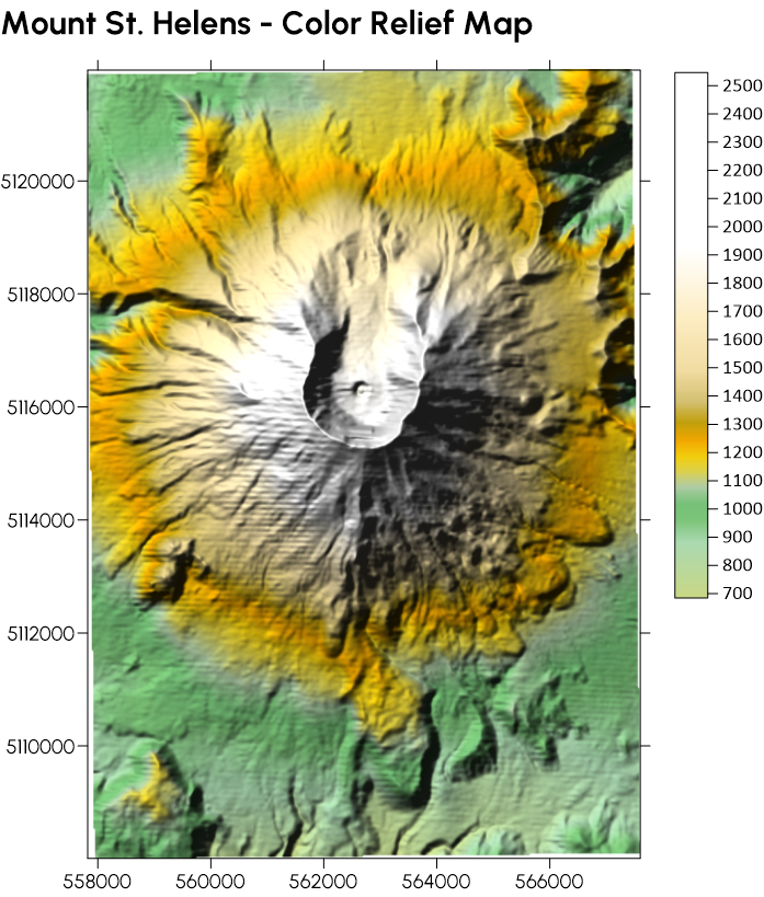
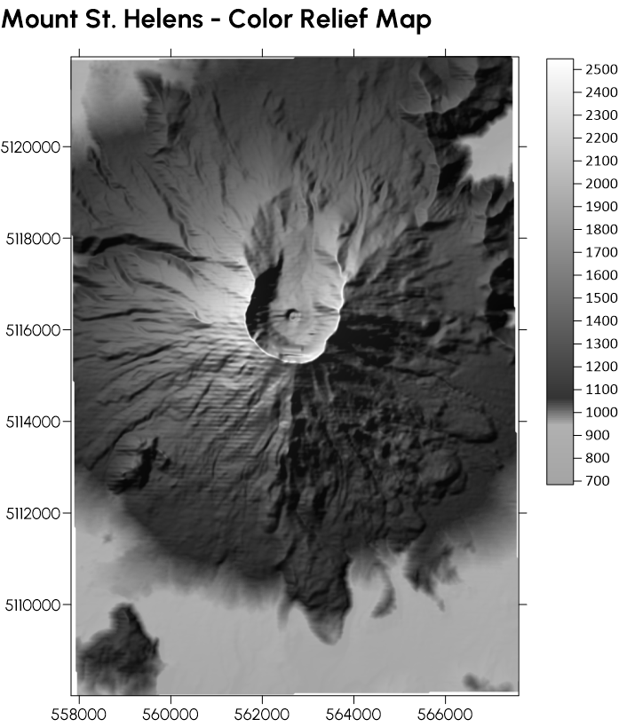
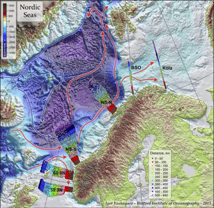
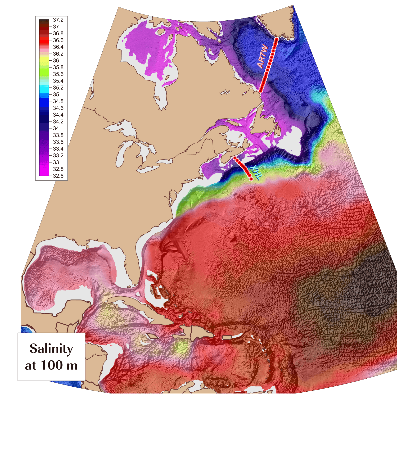
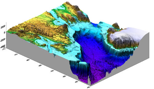
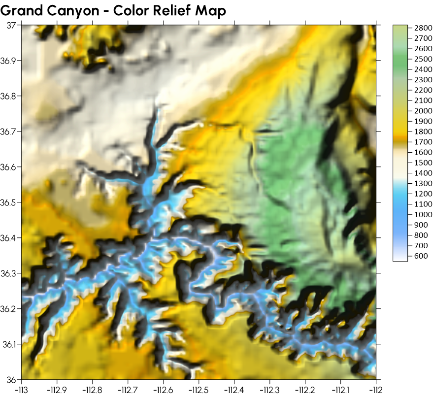
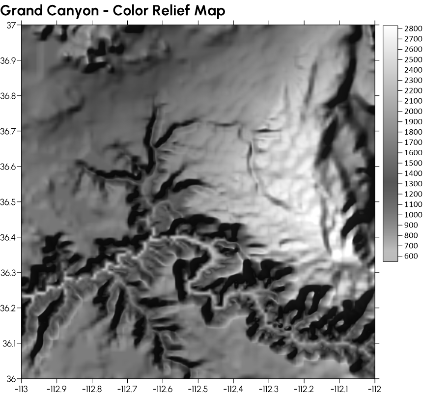
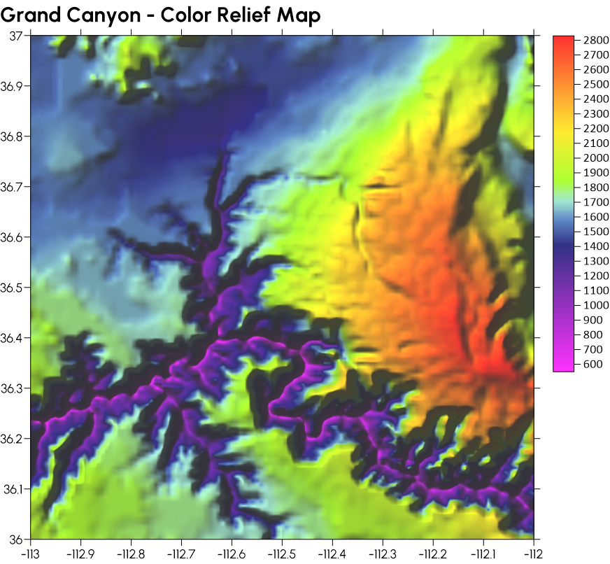
Great Examples of Color Relief Maps
With so many applications for color relief maps, it’s easy to find great examples of this visualization. The gallery below provides some of our favorites. Each one was made in Surfer and gives a good idea of what an effective and stunning color relief map looks like; check them out to see the impact these visuals have when done well.
Bringing Data to Life with Color Relief Maps
From uncovering ancient artifacts to planning disaster response efforts, color relief maps are empowering people across industries to make informed decisions with confidence. Their combination of functionality and visual appeal ensures data isn’t just understood—it’s remembered and acted upon.
With the benefits they offer, there’s no doubt color relief maps will continue to play a powerful role in data visualization as they’ve done throughout history. The only question is whether you have the right tool to make this type of visual stunning. If you need help creating a color relief map that clearly communicates complex data to stakeholders in your industry, download a free trial of Surfer.