Designing Cool Data Visualizations: How to Engage and Inspire Stakeholders
You deal with complex data daily, and finding ways to effectively visualize it isn’t easy—especially if you’re speaking to a non-technical audience. The good news? It’s possible to create maps and graphs that are so striking and memorable they wow stakeholders as soon as they see them. But here’s the thing to keep in mind: there are specific reasons some maps and graphs stand out more than others. If you want to transform complex information into cool data visualizations that impress stakeholders, there are strategies worth implementing.
10 Essential Design Strategies for Stunning Maps and Graphs
Let’s start by defining “cool data visualizations.” These are maps and graphs that are clear, compelling, and accurate, giving stakeholders the insights they need to make informed decisions. Creating them requires high-quality software (think Surfer and Grapher) and some essential design strategies. Here’s a closer look at those strategies to help you maximize the impact of your data visualizations.
1. Know the “Why”
Before you even begin designing, ask yourself: why are you creating this visualization? What’s the core message, who’s your audience, and in what context will they see it? Knowing your purpose, audience, and setting will help you shape both your visuals and messaging effectively. And remember, not every audience is the same. Are they data-savvy experts or industry newcomers? Tailoring the complexity of your graph to your audience ensures your message hits home.
2. Pick the Right Visual
With so many map and graph types, selecting the right one is crucial. Are you showing trends over time, comparing categories, or spotlighting outliers? Choose a format that suits your goal. Line graphs are great for trends, and bar charts spotlight comparisons—pick the tool that lets your data do the talking.
3. Remove Clutter
People can only absorb so much information at once, so it’s best to keep things simple. Strip out anything that doesn’t serve your message, like excessive gridlines, flashy fonts, or too many colors. This doesn’t mean you can’t get creative! It just means to use creative touches wisely to enhance readability and impact. For instance, a limited color palette can separate categories, or a bold color can make a key data point pop. Patterns and textures are also great subtle touches to differentiate without overwhelming.
4. Create Clear Labels
Ever heard of the Dual Code Theory? It suggests that information is more memorable when it includes visuals and text, especially if you’re communicating complex data. That’s where clear labeling comes into play on your maps and graphs. To reinforce understanding and retention, label your axes clearly and specify any units of measurement. If you’re working with multiple data series, add a legend that’s straightforward but helpful. Better yet, consider placing labels directly on your data points or lines, so your audience doesn’t have to hunt for context.
5. Prioritize Accuracy
Accuracy is everything when it comes to designing a great data visualization. Our recommendation? Watch out for pitfalls like improper scaling, truncated axes, or choosing a graph type that doesn’t quite fit—these can easily lead to misleading results. Also, start your axes at zero (unless there’s a solid reason not to) and be mindful of how your data is displayed to keep your message clear. Another great tip: don’t forget to double-check your data and visual to make sure everything is a true reflection of the information you’re sharing.
6. Emphasize Major Points
If you want stakeholders to walk away with the main takeaways from your data, emphasizing key points is essential. Think of it as guiding their focus—use elements like color, placement, and size to spotlight critical insights. These techniques draw attention to the most important data, ensuring that decision-makers know exactly where to look.
With this approach, you’ll tap into the Von Restorff Effect, also called the Isolation Effect. This psychological principle suggests that items standing out in a group are more memorable. So, by highlighting specific insights in your data visualization—like giving one or two bars in a chart a standout color—you’ll create a focal point that anchors attention and boosts recall. It’s a simple but powerful way to make your maps and graphs stick in stakeholders’ minds.
7. Use Color Wisely
When it comes to color, less is often more. Too many colors can create visual noise, so use them wisely and with purpose. Choose a limited palette to draw attention to specific data points and pick hues that carry meaning your audience will intuitively recognize. Colors can evoke emotions and associations, so thoughtful choices can make your data visualizations more impactful and memorable. For instance, a red color used for a contamination plume in a map immediately signals urgency or danger, while a green line on a graph often suggests growth, safety, or positivity. These subtle choices make your visuals resonate with stakeholders on a deeper level, helping them quickly grasp the story behind the data.
8. Ensure Its Accessible
When designing graphs, aim for accessibility so everyone can get the message. Use colors that work for those with color vision impairments, ensuring key information is clear to every stakeholder. High-contrast colors and legible fonts are also essential to make sure all viewers, including those with visual impairments, can read your data with ease.
9. Tell a Cohesive Story
Everyone loves a good story—whether it’s a novel, a film, or a powerful visual. Storytelling is memorable, which is why each map and graph should aim to tell a clear, meaningful story for stakeholders. Framing your visualization within a narrative structure enhances engagement and retention. So, guide your audience through your data by adding context where needed, highlighting key points, and creating a logical flow that connects one insight to the next.
This doesn’t mean adding unnecessary details or fluff. It’s about making sure your data has context and that each part of your visualization leads seamlessly to the next. By framing your data in a cohesive story, you’re not just sharing numbers—you’re taking stakeholders on a journey that makes the information meaningful and memorable.
10. Continuously Refine
Creating a top-notch map or graph usually takes a few rounds of tweaking. So after your initial design, get feedback from colleagues or test it with a small audience. Use their input to fine-tune your data visualization, making adjustments to boost clarity, accuracy, and impact. Each revision will help polish your design and ensure your graph or map is delivering its message loud and clear.
Another helpful trick? Start by pushing everything to the background, which forces you to be intentional about what you want to highlight. Then, use “pre-attentive attributes”—like color, shape, size, orientation, and spatial position—to make key data points pop. These attributes are processed by our brains almost instantly, so when considered and implemented effectively, they can refine your data visualizations to ensure stakeholders zero in on important information without consciously searching for it.
10 Examples of Cool Data Visualizations
Now that you know the design strategies to create great maps and graphs, it’s time to showcase examples that incorporate these best practices. Below are eight data visualizations that are clear, compelling, and accurate, making them the very definition of cool. However, before we dive into the details, here is a quick-reference guide to the examples featured in this blog.
| Visualization | Key “Cool” Feature |
|---|---|
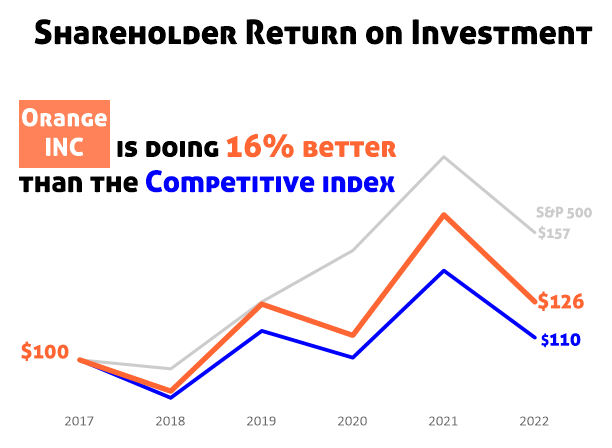
| Example 1: Visualizing Shareholder ROI | High-contrast color callouts |
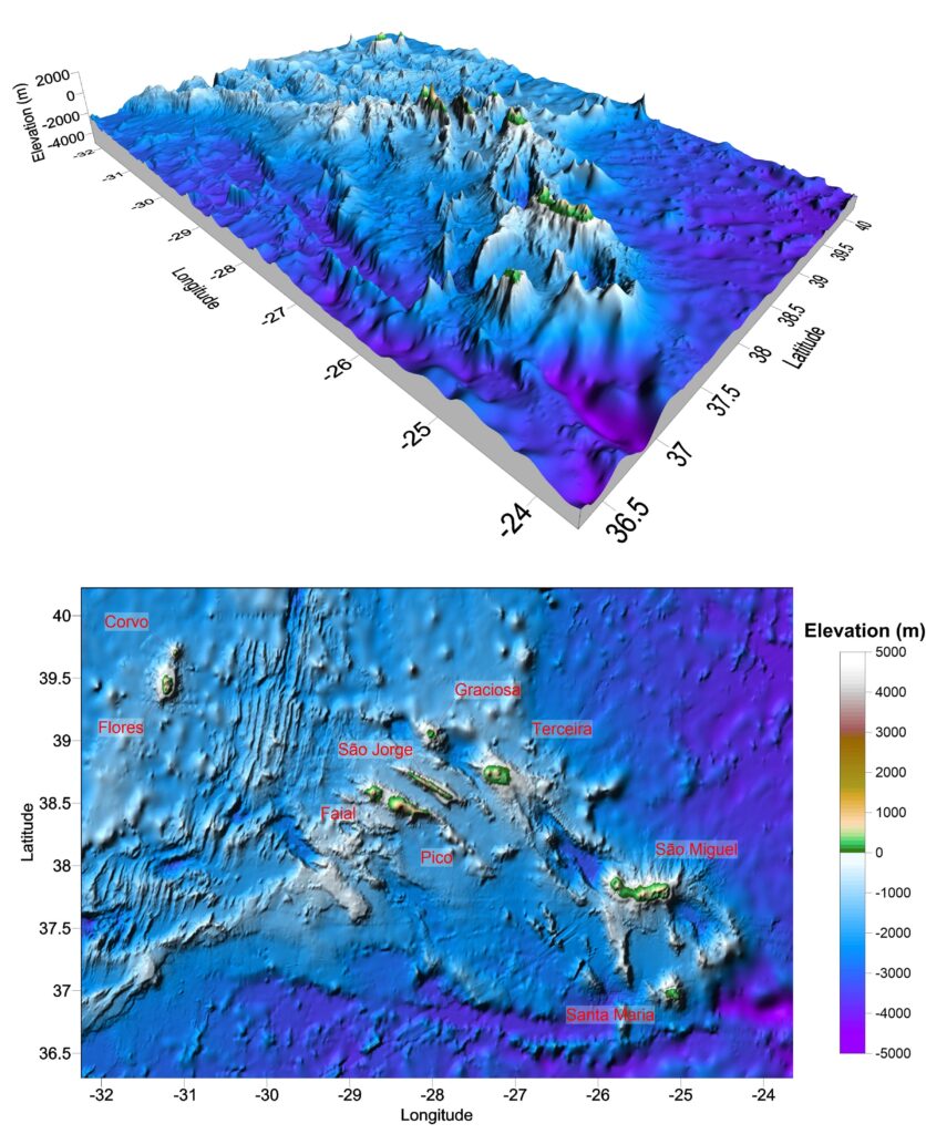
| Example 2: Revealing Complex Topographic Data of Azores Region | 90% colorblind accessibility |
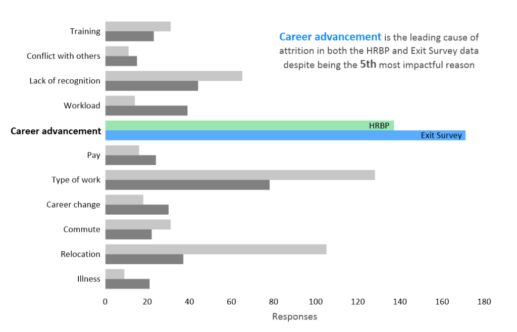
| Example 3: Analyzing Causes of Attrition | Comparative bar charting |
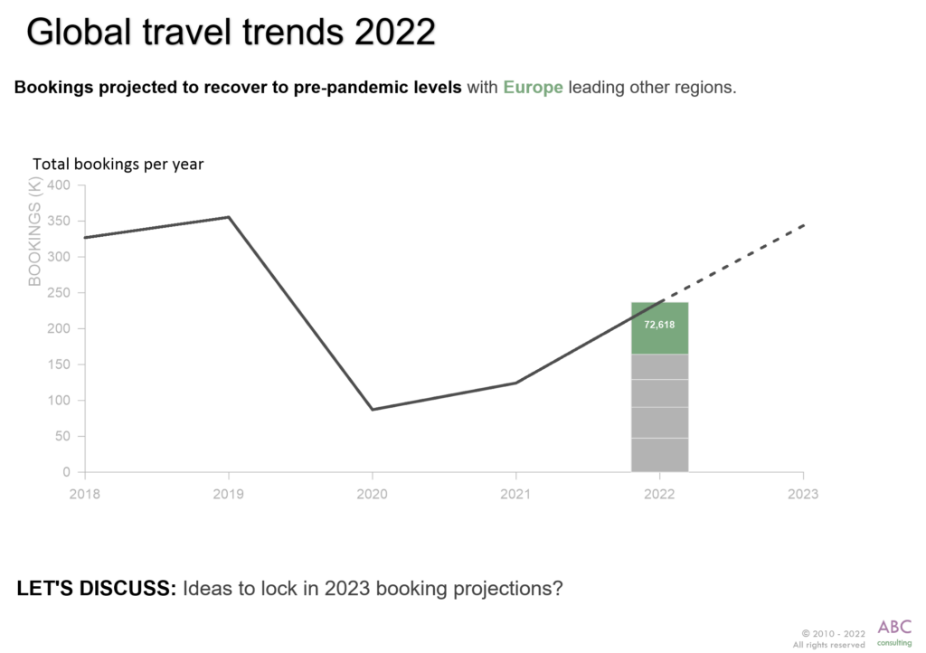
| Example 4: Tracking Travel Trends | Growth chart with multiple elements |
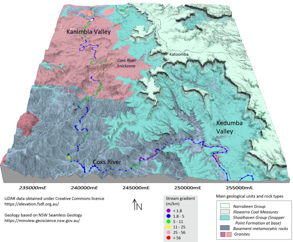
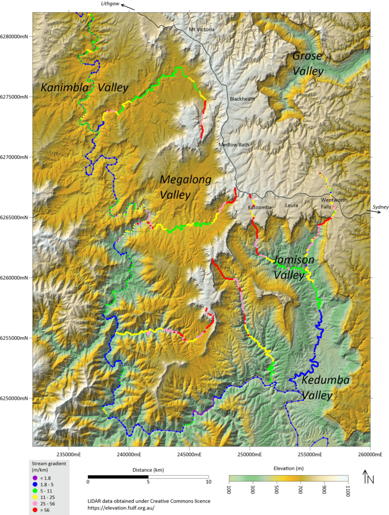
| Example 5: Bringing the Katoomba Valleys to Life | 3D topographic LiDAR |
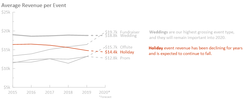
| Example 6: Showcasing Average Revenue per Event | Strategic trend highlights |
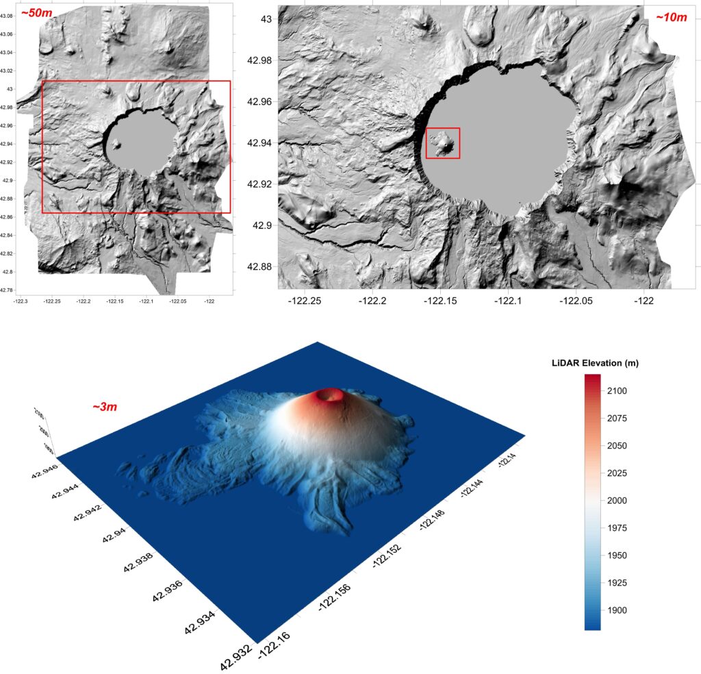
| Example 7: Uncovering Crater Lake | Multi-scale spatial resolution |
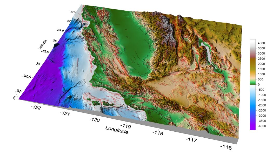
| Example 8: Showing Stunning Views From a California Fault Map | 3D surface relief and LiDAR |
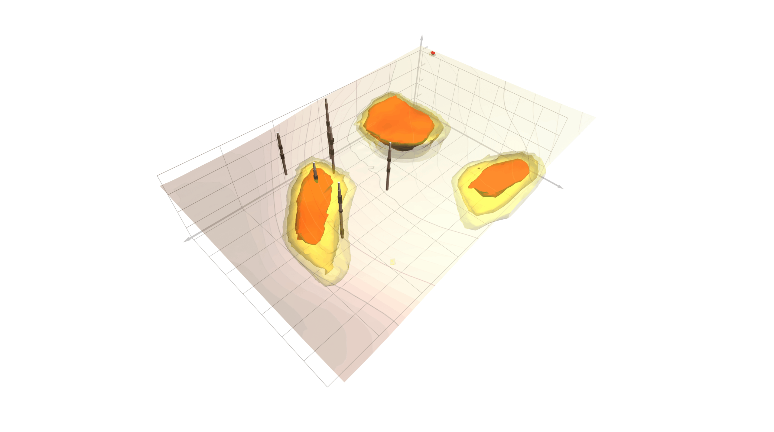
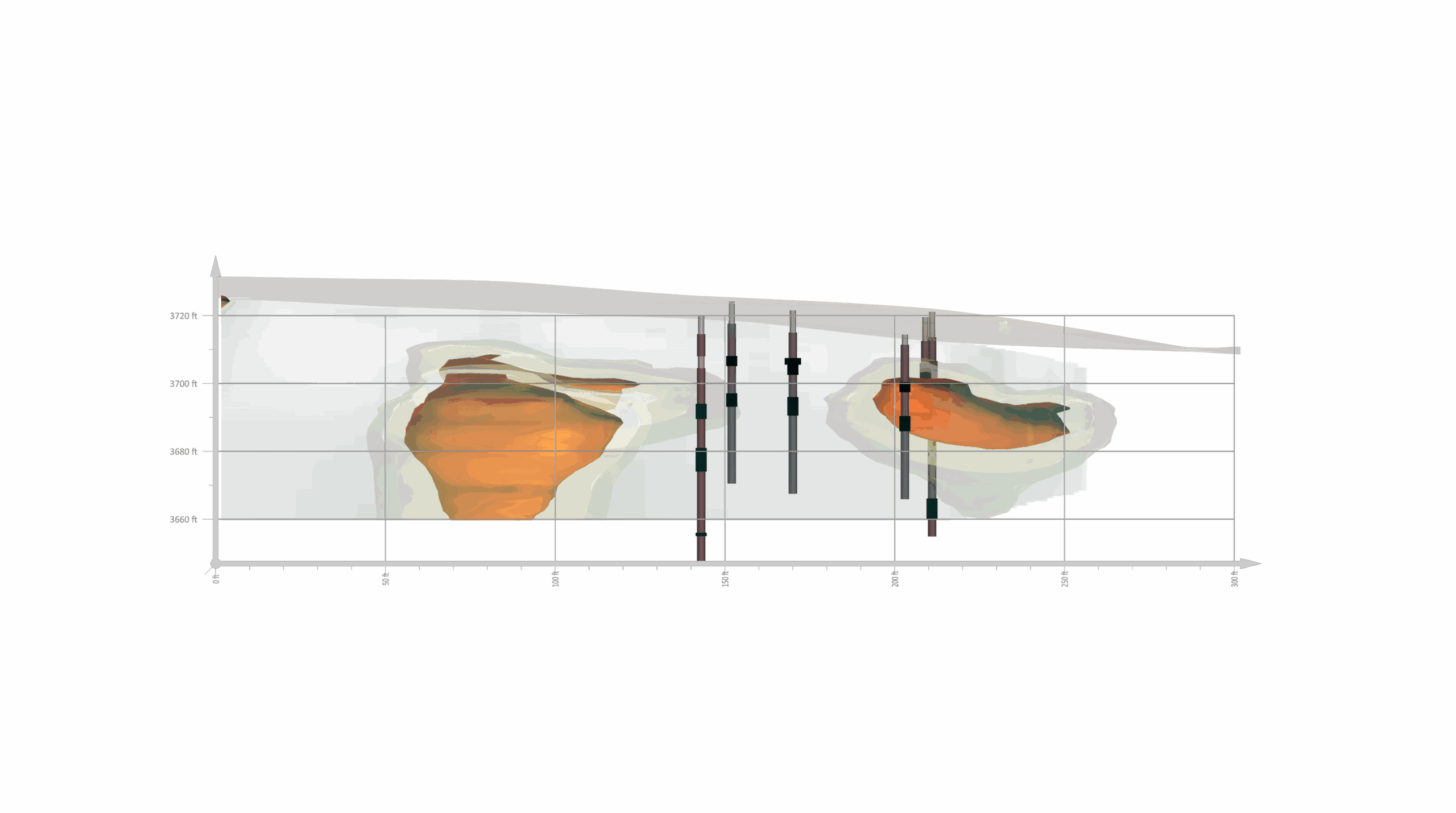
| Example 9: Reviving an “Un-Buildable” School Site with 3D Geophysics | Contours, layered transparency, and 3D modeling with geophysics data |
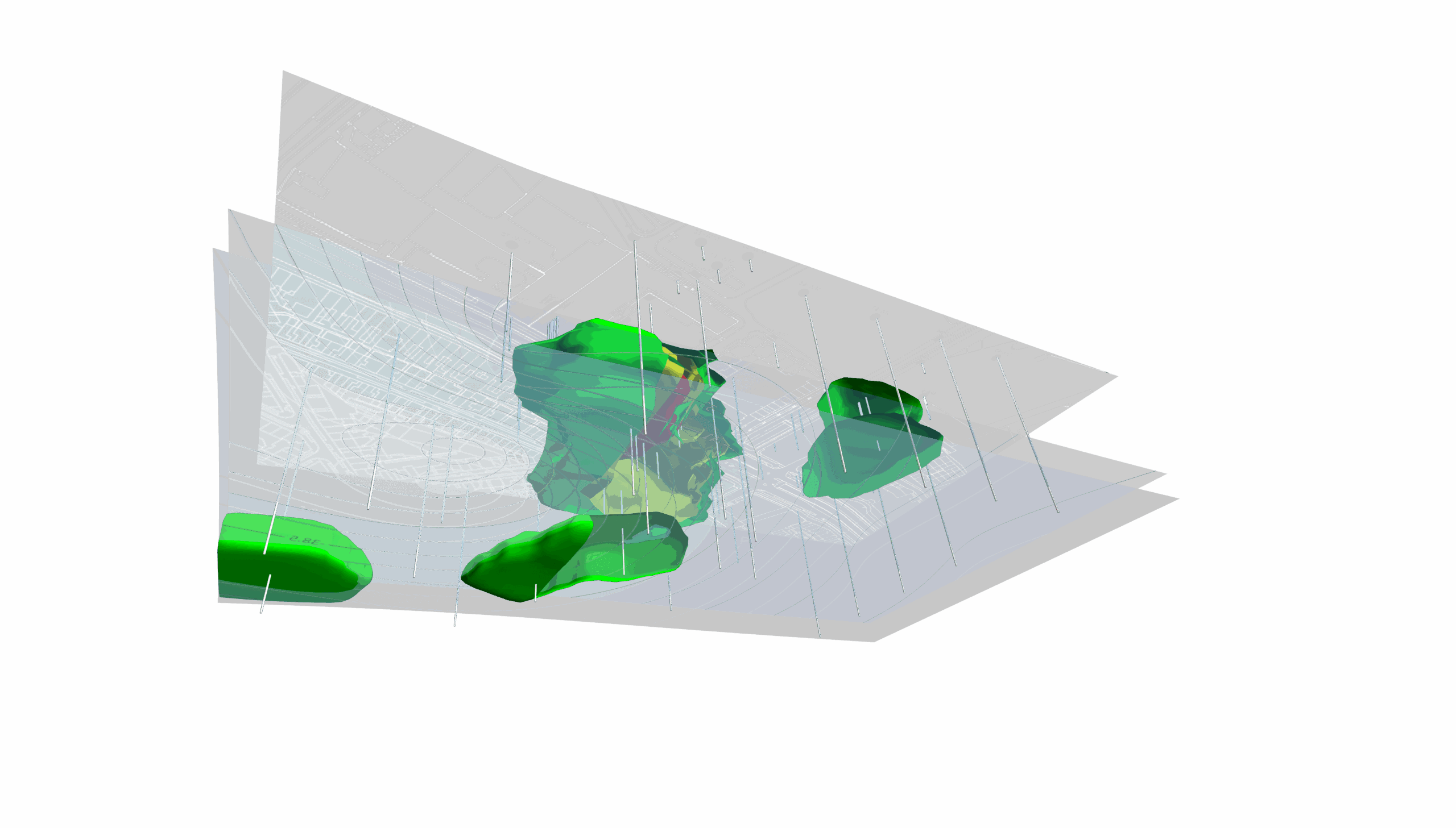
| Example 10: Illuminating Subsurface Contamination in Full 3D | Transparency, advanced lighting, and 3D modeling |
Example 1: Visualizing Shareholder ROI
Who created this graph: Golden Software
Software used: Grapher
Why this graph is cool: This graph is a textbook example of clear, impactful data visualization. Designed for universal understanding, it uses color intentionally—Orange Inc. in bold orange, the Competitive Index in blue, and the less relevant S&P 500 in subtle gray—to guide the viewer’s focus. The main story, “Orange Inc. is doing 16% better than the Competitive Index,” is reinforced with a mix of copy and visuals, ensuring the takeaway is instantly clear. Clean, clutter-free, and memorable, this graph tells a compelling story of Orange Inc.’s outperformance over time.
Example 2: Revealing Complex Topographic Data of the Azores Region
Who created this map: Lester Anderson, structural geologist and cartographer
Software used: Surfer
Why these maps are cool: These maps are an excellent example of visualizing complex topographic data in an accessible, engaging way, ideal for a broad audience. Clearly labeled and thoughtfully designed, they make it easy to explore the Azores—a breathtaking archipelago in the mid-Atlantic known for its dramatic landscapes, elevation changes, fishing villages, and lush pastures.
The color scheme is carefully chosen, with distinct shades highlighting elevation changes that remain accessible to around 90% of colorblind viewers. This thoughtful use of color also gives an intuitive understanding of the varying depths and heights, from ocean valleys to towering island peaks.
Organized and clutter-free, the maps also tell the story of the Azores’ unique geography and its relationship to the surrounding seafloor. They seamlessly layer Global Multi-Resolution Topography (GMRT) data, multibeam bathymetry of the Mid-Atlantic Ridge, and detailed survey data around the islands. Together, they create a cohesive, accurate visualization, offering a vivid snapshot of the Azores’ topography and its stunning natural beauty.
Example 3: Analyzing Causes of Attrition
Who created this graph: Golden Software
Software used: Grapher
Why this graph is cool: This graph is a powerful example of how data visualization can uncover key insights with clarity and impact. Designed for easy understanding, it uses color thoughtfully—green for HRBP responses and blue for Exit Survey responses—making it simple to distinguish between data sets. The main takeaway is also clear: while the company assumed training was driving attrition, both HRBP and Exit Survey data reveal a different story. Career advancement, not training, is the top reason employees are leaving. This contrast highlights a crucial insight that may encourage the company to revisit its retention strategies. With a clean, clutter-free design, this graph combines copy and visuals to tell a compelling, data-driven story that challenges assumptions and suggests a fresh approach to employee retention.
Example 4: Tracking Travel Trends
Who created this graph: Golden Software
Software used: Grapher
Why this graph is cool: This graph is a standout example of clear, engaging data visualization designed for decision-making. Simple and uncluttered, it uses green to spotlight Europe as the leader in booking recovery post-pandemic. The upward trend since 2020’s dip is immediately clear, with supporting text noting the return to pre-pandemic levels. A question at the bottom—“Ideas to lock in 2023 booking projections?”—also adds an interactive touch, prompting stakeholders to consider next steps. Overall, this graph tells a story about the travel industry’s recovery, while simultaneously highlighting Europe’s growth and inspiring action.
Example 5: Bringing the Katoomba Valleys to Life
Who created these maps: Peter Hatherly, geophysicist
Software used: Surfer
Why these maps are cool: These maps are exemplary, accessible visualizations of the Blue Mountains in New South Wales. Designed to be easily understood by a broad audience, they’re carefully labeled and use color effectively to highlight key areas of interest. The first map provides a detailed 3D topographic representation of the Katoomba Valleys using public-access LiDAR data, offering a striking and accurate view of geological features. The map’s carefully chosen colors also ensure accessibility for about 75% of colorblind viewers, making it both visually impactful and inclusive.
The second map takes a more traditional topographic view, showcasing the typical landscape of the Katoomba Valleys. It complements the 3D map by focusing on terrain and stream gradients, providing a straightforward, clutter-free look at the area’s topography that’s also accessible to a majority of colorblind viewers. Together, these maps offer a comprehensive view of this unique region.
Example 6: Showcasing Average Revenue per Event
Who created this graph: Golden Software
Software used: Grapher
Why this graph is cool: This graph is a strong example of storytelling with data. Its clean, uncluttered design makes it easy to understand, and the red line strategically highlights the decline in holiday revenue over time, drawing immediate attention to this trend. Clear labels and accompanying text also reinforce the main takeaway: holiday events are on a steady downturn, while categories like weddings remain stable or show growth. By blending visuals and text, this graph provides a compelling narrative that helps stakeholders see where priorities might need to shift, encouraging data-driven decision-making for the future.
Example 7: Uncovering Crater Lake
Who created this map: Lester Anderson, structural geologist and cartographer
Software used: Surfer
Why these maps are cool: This series of maps beautifully captures Crater Lake in Oregon, showcasing the precision of high-resolution LiDAR data. The primary map is clearly labeled with a color gradient—from cool blues to warm reds—that makes elevation changes instantly recognizable and accessible to about 90% of colorblind viewers.
With a clean and uncluttered design, the maps allow the lake’s landscape details to stand out, adjusting spatial resolution based on zoom level: the full region is shown at 50m, a mid-range view at 10m, and a close-up of Wizard Island at an impressive 3m resolution. This gradual focus highlights how different levels of spatial resolution can uncover increasingly fine details depending on the area of interest.
Combining GMRT data for broader views and high-detail LiDAR for close-ups, these maps offer layered insights that stakeholders can easily interpret. The final close-up of Wizard Island is particularly striking, showing the island’s intricate landforms in precise detail. Altogether, the maps present a rich, layered story of Crater Lake’s unique topography, from expansive views to fine features.
Example 8: Showing Stunning Views From a California Fault Map
Who created this map: Lester Anderson, structural geologist and cartographer
Software used: Surfer
Why this map is cool: This 3D map offers a stunning perspective of California’s landscape, spanning from sea level to desert mountains, with a clear legend indicating elevation changes. Designed to be accessible for all audiences, including around 90% of colorblind viewers, it uses carefully selected colors to distinguish elevation and fault lines, making key features easy to interpret.
The clean, uncluttered design combines a 3D surface view with shaded relief, revealing how major fault systems shape California’s rugged terrain. This map also effectively illustrates the relationship between fault lines and topography, providing a compelling look at how geological structures define the state’s unique land.
Created using various features in Surfer, the map merges multiple data sources to aid regional interpretation. A Surfer base map integrates California’s fault database as a shapefile, clearly defining fault lines, while GMRT data offers a broad overview and ASTER data adds finer details with 10m resolution. With an optimal angle chosen to emphasize fault line trends, this map provides a clear, visually engaging tool for exploring California’s geological landscape.
Example 9: Reviving an “Un-Buildable” School Site with 3D Geophysics
Who created this visualization: Andy Siemens, P.E., G.E.
Software used: Surfer
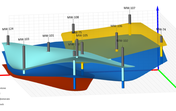
Why these visualizations are cool: These 3D models are a powerful example of how data visualization can completely change the trajectory of a project. When a school district was told their preferred construction site was “un-buildable” due to suspected air-filled voids beneath a soccer field, uncertainty stalled progress. The original investigation relied on air-percussion drilling, which produced inconsistent results in fractured volcanic basalt. The interpretation suggested unpredictable, potentially large voids—but the confidence level was low.
Instead of accepting that verdict, a second geotechnical firm partnered with Andy Siemens to approach the problem differently. Using electrical resistivity tomography (ERT) in 3D, Andy mapped subsurface resistivity variations across the entire site and transformed the results into a fully interactive 3D visualization.
These visualizations bring together three critical elements:
- Contour layers that illustrate surface topography
- Isosurfaces shown here in warm yellow and orange tones that highlight zones of anomalous resistivity
- Drillholes positioned strategically to validate and ground-truth the model
From a design standpoint, the 3D models succeed for several reasons:
- Layered transparency allows viewers to see both the terrain and the subsurface simultaneously without visual clutter
- Color gradients clearly distinguish zones of interest, drawing attention to higher-resistivity anomalies without overwhelming the scene
- Strategic placement of boreholes visually reinforces how geophysics guided cost-effective, targeted drilling rather than blanket exploration
The outcome? Sonic drilling confirmed the geophysical interpretation. A minor anomaly was identified as unconsolidated pumicite—not a massive air-filled void. No large subsurface cavities were found within the preferred footprint. The site once labeled “un-buildable” was cleared for development.
Example 10: Illuminating Subsurface Contamination in Full 3D
Who created this visualization: Golden Software
Software used: Surfer
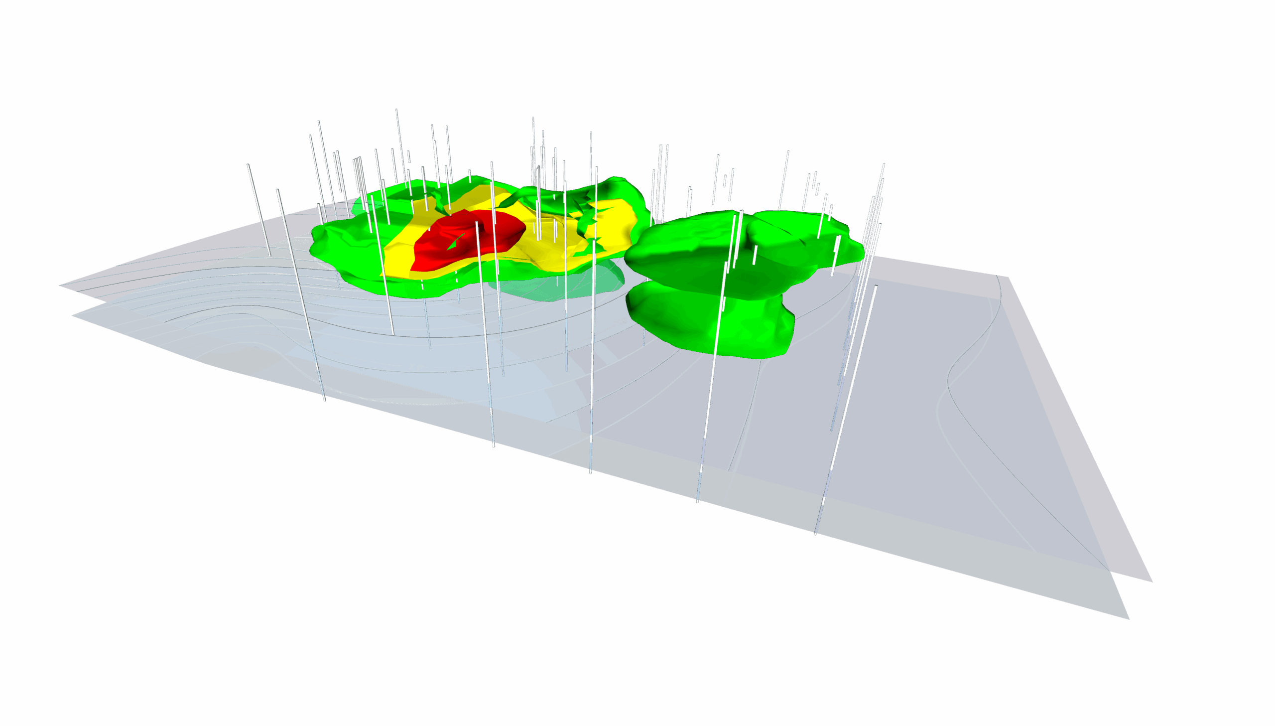
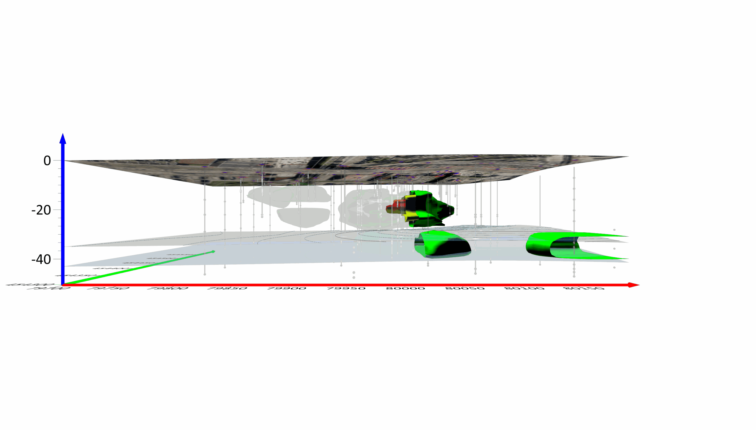
Why these visualizations are cool: These 3D visualizations showcase how advanced rendering tools can transform complex environmental data into a publication-ready, stakeholder-friendly model.
The images depict a groundwater contamination investigation. The colored volumetric shapes represent contamination plumes at varying threshold levels—green for lower concentrations, yellow for moderate levels, and red highlighting the highest concentrations. White vertical lines mark drillholes, grounding the model in measured field data. A satellite imagery layer draped across the surface adds geographic context, helping viewers connect subsurface conditions to visible infrastructure and land features.
What makes this visualization stand out isn’t just what it shows—it’s how it shows it. Three design elements elevate it from informative to impressive:
- Lighting Effects for Publication-Quality Clarity: The lighting is used strategically to enhance depth perception and surface contrast. By adjusting intensity, direction, and surface shininess, the contamination plumes become more defined, making threshold transitions easier to interpret. This refinement improves visual differentiation between concentration zones and ensures the model remains clear and professional from any viewing angle. The result is a polished graphic that is both analytically precise and visually compelling.
- Full 3D Rotation for Complete Spatial Understanding: This model can be tilted, rotated, and even viewed from below. From one angle, you see plumes spread across the site. From another, you can evaluate depth relative to drillhole data. This flexibility strengthens analysis and ensures critical spatial relationships are not overlooked. It also equips professionals to present findings confidently, knowing they’ve examined the model from every perspective.
- Transparency Control to Reveal Subsurface Detail: Transparency adjustments allow upper layers—like surface terrain or satellite imagery—to become semi-transparent, revealing deeper contamination zones beneath. In standard 3D views, these layers would block visibility. Here, transparency exposes the full vertical story of the site, from surface conditions down through subsurface plumes. For groundwater assessments and remediation planning, this layered visibility provides clarity that static visuals simply cannot deliver.
Together, these design elements turn complex contamination data into a clear, layered, and decision-ready visualization.
Design Data Visualizations that Impress
Creating cool data visualizations isn’t as hard as it may seem. By implementing best design practices, you can design meaningful maps and graphs that impress stakeholders—just like we’ve seen others do. So, want to try creating data visualizations that are clear, compelling, and accurate?
