Key Takeaways from Storytelling with Data (Pt 3): How to De-Clutter Your Data Visualization
A great story has a focus—a clear narrative that keeps the audience engaged from start to finish. But when a story tries to cover too much at once, it risks losing its audience. The same holds true for your data visualizations. If your visualization is cluttered with too many data points, overlapping labels, or unnecessary elements, it can confuse stakeholders and bury the story you’re trying to tell.
Think about it: a cluttered graph or chart is like a book with too many subplots. It’s overwhelming, distracting, and ultimately decreases understanding. You might try to share critical insights with your stakeholders, but if they’re left squinting at a chaotic visual to decipher a tangled web of data, your message won’t land the way you intended.
So, how do you ensure your data visualizations are clear, engaging, and free of unnecessary distractions? In this next part of our series on Key Takeaways from Storytelling with Data, we’ll walk you through how to de-clutter your graphs and charts to make your story shine.
De-Cluttering Starts with Managing Cognitive Load
To create clear and engaging data visualizations, it’s crucial to start with a foundational concept from psychology: cognitive load. Understanding this concept, as highlighted in Storytelling with Data, is key to making sure your visualizations tell their story without overwhelming stakeholders.
So, what exactly is cognitive load? Simply put, it’s the amount of mental effort your brain has to use to process information. When too much information comes in at once, it’s like an overflowing inbox—our brains struggle to keep up. Important details get overlooked, tasks become harder, and it’s easy to feel overwhelmed. In the context of data visualization, a cluttered graph or chart can spike cognitive load, forcing stakeholders to spend more time deciphering the layout than understanding the insights.
If you’re a geoscientist sharing data in graphs and charts, keeping cognitive load to a minimum is vital. Your audience has a finite amount of mental processing power. Every second spent untangling cluttered labels, excessive data points, or confusing layouts is time and energy not spent absorbing the data-driven story you so worked hard to uncover.
Simplifying Visuals with Gestalt Principles of Design
Now, for the next part: how exactly do you minimize any and all complexity in your graphs and charts? To design clutter-free data visualizations, you need to decrease cognitive load by organizing your visuals in a way that naturally resonates with how humans perceive the world. This is where the Gestalt Principles of Visual Design come into play.
Developed in the 1920s by German psychologists Max Wertheimer, Kurt Koffka, and Wolfgang Köhler, these principles explore how humans make sense of what they see and hear. At their core, the Gestalt Principles describe how people instinctively group similar elements, identify patterns, and simplify complex visuals. The word “Gestalt” itself even translates to “unified whole,” reflecting the idea that people’s minds tend to perceive individual elements as part of a cohesive picture.
While initially developed to understand human perception, the Gestalt Principles have been embraced by graphic designers as a guide for creating visuals that are both eye-catching and easy to understand. Today, they’re also a game-changer for data visualizations as well. If you apply them to your graphs or charts, you can de-clutter your visuals to reduce cognitive load, making your data’s story much easier for stakeholders to grasp. Keeping that in mind, here are six key Gestalt Principles outlined in Storytelling with Data that can make your graphs and charts clearer and more effective.
1. Proximity
We naturally group elements that are close to one another, distinguishing them from those that are farther apart. In data visualizations, proximity can be used to organize information into meaningful groups. For example, placing related data points or labels close together signals to your audience that these elements are connected, making it easier for them to interpret the story behind your data.
2. Similarity
Our brains are wired to group elements that share similar visual characteristics—such as color, size, or shape. In data visualization, you can use this principle to highlight relationships and distinctions. For instance, using the same color for data points that belong to a specific category helps viewers immediately understand which points are related, without additional explanation.
3. Continuity
The principle of continuity states that people prefer visuals with a clear, continuous flow. The human eye naturally follows paths, lines, and curves, so aligning elements in a way that guides stakeholders’ gaze ensures your data story is easy to follow. A well-placed trendline in a scatter plot, for instance, draws attention to the overall pattern rather than individual, disconnected data points.
4. Closure
The closure principle reflects people’s preference for simplicity and completeness. When humans see partial shapes or patterns, their minds tend to fill in the gaps to perceive them as a whole. This principle can be leveraged to simplify visuals—your audience will “connect the dots” without the need for excessive design elements, keeping your graphs and charts clean and focused.
5. Enclosure
People perceive elements that are physically enclosed together as part of the same group. This doesn’t require anything dramatic—simple techniques like shading the background or placing a border around related elements are enough to visually organize your data and emphasize relationships.
6. Connection
This principle suggests that humans perceive elements as related when they are physically connected by lines or other visual links. In data visualizations, this could mean using lines to connect dots in a time series chart or arrows to indicate relationships in a flowchart. These connections provide clarity and reinforce the relationships you want your audience to notice.
Bringing the Story to Life: A Before-and-After Example Using Gestalt Principles
Let’s take a closer look at how the Gestalt Principles can transform a cluttered and confusing data visualization into a clear, impactful one. Below is a before-and-after example created in Grapher that shows how applying these principles can make all the difference in communicating your data’s story effectively.
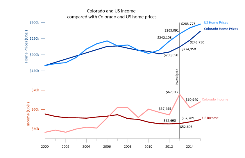
The Before: Cluttered and Misleading
In the “before” visualization, it’s clear that while the graph showcases Grapher’s many unique features, it doesn’t do a great job of telling the story behind the data. Here are the key issues:
- Multiple Y-Axes Confusion: Each side of the graph represents different ranges, but the layout makes it seem like Colorado and U.S. home prices are lower than incomes—completely flipping the narrative. Stakeholders might walk away with the wrong conclusion or simply think the graph is incorrect, causing the speaker to lose credibility.
- Symbol and Text Overload: The chart is full of circles, lines, and text, distracting from the key takeaways rather than informing.
- Distracting Gridlines: The busy background of gridlines compete for attention, making it harder to focus on the actual data.
- Cluttered Design: The data labels follow the curves of the plots, but this adds visual noise and doesn’t provide the clarity stakeholders need to interpret the story quickly.
While this version highlights Grapher’s functionalities as it’s designed to do, it doesn’t provide a polished and user-friendly experience. The story being told—about the disparity between incomes and home prices—is muddied by the clutter and confusing design choices.
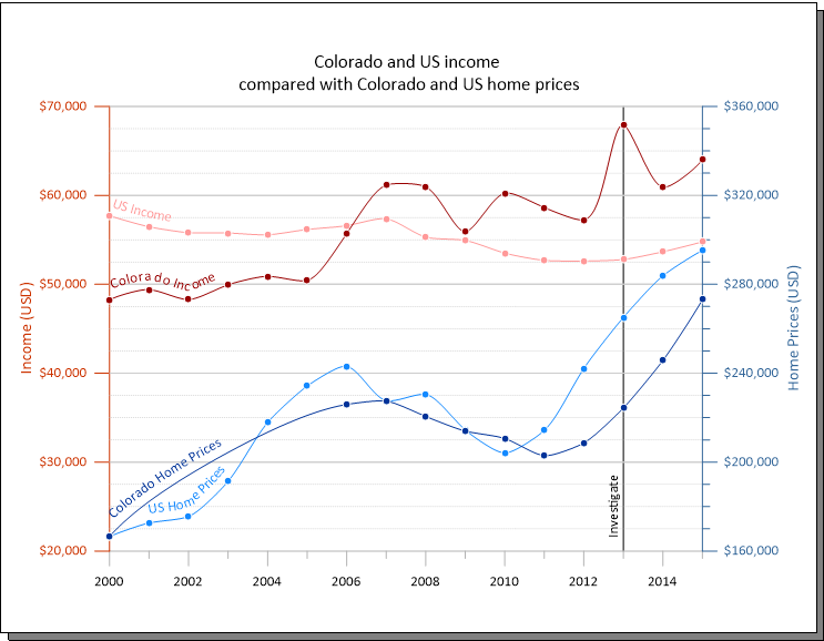
The After: Clean and Clear
Now, let’s look at the “after” visualization designed in Grapher, which applies Gestalt Principles to create a cleaner, more focused graph:
- Unified Y-Axis Placement: Both sets of axes are on the same side, separated by context. This equips viewers to clearly compare the trends in incomes and home prices—clarifying the central story of the graph.
- Simplified Lines: The circles have been removed, leaving bold, clean trend lines that make it easy to follow the overall patterns.
- De-cluttered Gridlines: The gridlines have been removed, ensuring the data itself takes center stage.
- Focus on Key Insights: A black vertical line highlights a specific point in time, directing attention to where it matters most. Key values for Colorado income and home prices are also pulled out and displayed directly on the graph, eliminating any need for guessing.
- Improved Labeling: The labeling no longer follows curve lines and is well-placed to the side, reducing visual noise.
Why the After Works
This refined visualization is a great example of how Gestalt Principles—proximity, similarity, continuity, closure, and more—can work together to de-clutter your data visualization and guide stakeholders’ focus. Here’s how:
- Proximity: By grouping income and home price data into their own ranges, the visual avoids mixing unrelated elements and enhances readability.
- Similarity: The consistent use of colors and line styles makes it easy to identify trends without overloading viewers with extraneous symbols.
- Continuity: The bold, continuous lines create a natural flow for the eye to follow, ensuring the key story comes through.
- Enclosure: Home prices and income levels are enclosed in separate groups, making it easier to see that two halves are working together to create one whole.
- Closure: While home prices and income levels are grouped separately, the vertical reference line going them shows they’re both part of a bigger picture, closing any gaps in understanding.
- Connection: By using shades of blue for home price data and shades of red for income data, the graph connects similar insights together, removing any ambiguity so stakeholders immediately grasp the insight.
The result? A graph that doesn’t just look cleaner but also communicates the disparity between trends in incomes and home prices effectively—keeping stakeholders engaged and informed.
The Lesson
This before-and-after comparison illustrates how applying the Gestalt Principles can make your data visualization more impactful. By de-cluttering your design and focusing on clarity, you can ensure that your data’s story not only stands out but also resonates with your audience.
Wrapping It Up: Clarity is Key
Creating meaningful data visualizations is all about delivering a clear story that engages your audience. When you focus on clarity, intentionality, and simplicity, your data visualizations become more than just graphs or charts—they become compelling narratives that resonate with stakeholders, guide their understanding, and inspire action. So as you create your next data visualization, remember: a little de-cluttering goes a long way in making your story shine.
Want to learn more on how to enhance your graphs and charts for stakeholders? Stay tuned for the next blog in our series to continue unpacking how to design data visualizations that tell a story viewers understand and use to make informed decisions. To ensure you don’t miss anything, subscribe to our blog for updates!