How a Single High-Profile Plot Evolved Over a Quarter of a Century: The Technology & Approach Igor Yashayaev Used To Build and Enhance One Visual
Some visuals are so compelling they stand the test of time, evolving alongside the science they represent. Igor Yashayaev, PhD, a researcher at the Bedford Institute of Oceanography, created one such plot more than 25 years ago. What began as a straightforward visualization has since been enhanced to become a principal reference for the oceanic process and variability in a key location for the planetary climate—earning its place in a Nobel Peace Prize winning report, multiple books and textbooks, and high-profile scientific publications, some provoking a broad public resonance and inspiring a blockbuster movie.
With Surfer, Igor has continuously fine-tuned and updated the high-profile visualization, leveraging advances in technology while maintaining a meticulous approach to clarity and accuracy. But what does it take to craft a single plot so impactful that it remains relevant for decades? We’ll unpack the evolution of this plot, exploring the technology and approach that have shaped its journey—from its first iteration to the influential visual it continues to be today.
Understanding Ocean Mixing and Freshwater Trends
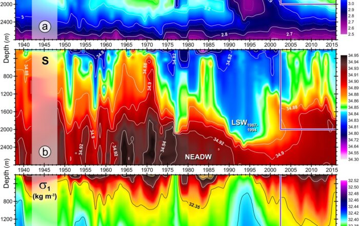
First things first: what insights does Igor’s plot reveal? At its core, the visualization is a window into the changing dynamics and climate state of the Labrador Sea, a critical area between Greenland and Canada. This sea is one of the few places in the world’s ocean where deep convection happens, a process of intense vertical ocean mixing driven by cold winter air outbreaks that cool the ocean surface, increasing the density of surface water and causing it to sink and mix with the water below. During some years, this process of vertical mixing is capable of homogenizing to “visible” uniformity layers up to 2,500 meters thick. However, during mild winters, most of the water column remains unmixed, with convection reaching just a few hundred meters. Given the variability, creating accurate, thorough, and detailed visualizations of this process is instrumental for ocean research and mapping year-to-year changes and trends. That’s where Igor’s plot enters the picture.
The visualization Igor created illustrates the temperature and salinity of the water column in the Labrador Sea over multiple years. One of the most striking insights revealed by the plot is the freshening of the Labrador Sea in the 1990s. As more freshwater entered the system—whether through continents, air, or melted sea ice—it mixed with the saltwater, making the upper layer fresher. Once the cool winter air decreased the temperature of the ocean surface, that water began to sink, bringing large amounts of fresh water into the deep layers of the ocean, freshening a significant part of the water column. By showcasing this and tracking long-term patterns, the plot has provided a clear, data-driven story of ocean change, offering valuable insights into climate variability and the broader impact of shifting temperature and salinity levels in the North Atlantic.
Where the Plot Has Been Featured Over Time
Because Igor’s plot has become a defining representation of oceanographic change, it’s received significant recognition over the years. This single visualization and its variations have appeared in scientific papers like Nature and even influenced popular culture. To put its impact into perspective, here’s a look at some of the main places Igor’s plot has appeared and what it’s influenced.
2001 Book Appearance
2002 Nature Journal Appearance
2007 IPCC Climate Report Appearance
2016 Journal of Geophysical Research Appearance
2024 Communications Earth & Environment Appearance
The First Appearance: A 2001 Book on Global Ocean Circulation
The plot’s first major feature was in the 2001 book titled Ocean Circulation and Climate: Observing and Modelling the Global Ocean. It was published as part of the first compilation of the results of the World Ocean Circulation Experiment (WOCE). At the time, Igor was a postdoctoral researcher in Canada, contributing to a large oceanographic program. His visualization caught the attention of Bob Dickson, a distinguished oceanographer and lead author who was compiling work for the book. Impressed by the clarity of the plot, Dickson invited Igor to contribute it to a chapter—a major opportunity for a young researcher.
A Landmark Study: The 2002 Nature Paper on North Atlantic Freshening
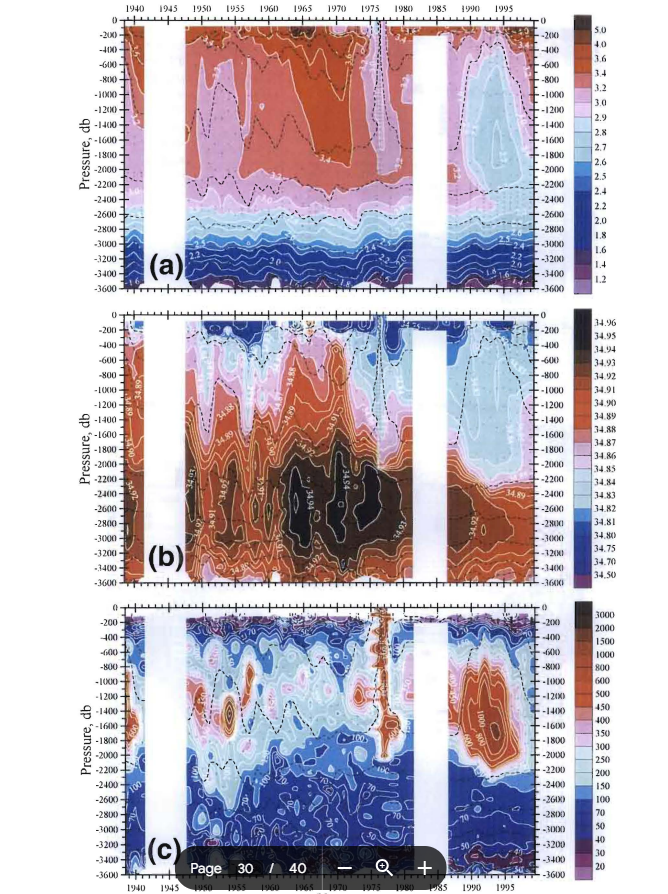
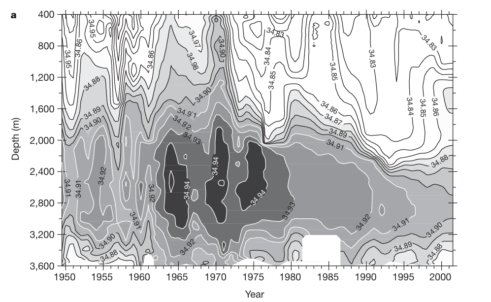
Following its book debut, the plot became even more influential when it was featured in the 2002 Nature paper Rapid Freshening of the Deep North Atlantic Ocean Over the Past Four Decades. This study revealed a striking long-term trend: significant freshening of the deep ocean, driven by increased freshwater input from Arctic ice melt, rivers, and precipitation. You can see the plot in Figure 1a. Igor fine-tuned every possible detail of the visualization in Surfer to ensure clarity—and the overall paper gained widespread recognition, accumulating over 800 citations in scientific journals.
This paper also led to unexpected cultural influence. Robert Gagosian, Director of the Woods Hole Oceanographic Institution (WHOI) at the time, was impressed by the work, leading him to publish a commentary article where he misinterpreted the key message of the paper, believing the observed freshening would inhibit deep convection and Meridional Overturning Circulation (MOC), potentially triggering a dramatic man-made ice age. While the interpretation was inaccurate, it inspired the climate disaster film The Day After Tomorrow.
What Igor’s plot and the 2002 Nature paper really revealed was quite the opposite of what the WHOI director had claimed. The freshening of the North Atlantic actually coincided with the strongest and deepest winter convection in the Labrador Sea. Rather than allowing the lighter, fresher water to remain trapped in the upper layer, this deep convection mixed it throughout the entire water column, illuminating the danger of a convective shutdown and a new ice age from a broken MOC. In a way, Igor claimed that the ocean and the Labrador Sea had a hidden ability to sustain stress to a certain limit, a critical reason why deep convection must be observed in real-time, mapped, diagnosed, and understood.
A Nobel-Linked Contribution: The 2007 IPCC Climate Report
By 2007, the plot had reached another milestone—it was included in the Intergovernmental Panel on Climate Change (IPCC) Fourth Assessment Report, which was awarded half of a Nobel Peace Prize, while the other half went to Al Gore. As a contributing author to Chapter 5 of the report, which examined oceanic climate change and sea level shifts, Igor was a member of the IPCC team that became a Nobel Peace Prize laureate, bringing the plot made with Surfer on board. Section 5.3.2.1 of the report specifically highlighted the North Atlantic Subpolar Gyre, Labrador Sea, and Nordic Seas, featuring a version of Igor’s now-iconic visualization.
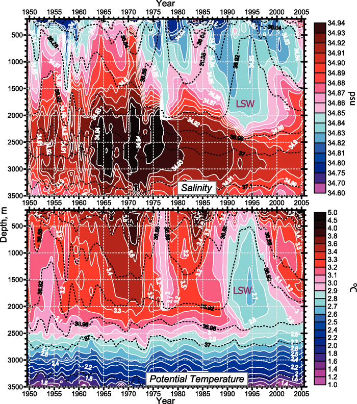
Refining the Plot: 2016 Journal of Geophysical Research Update
As oceanographic research progressed, so did Igor’s plot. Different versions of the full-depth multidecadal observation-based Labrador Sea variability series entered many peer-reviewed publications and reports and were reproduced in several textbooks and publications. One example is the refined version that appeared in the 2016 Journal of Geophysical Research: Oceans paper, Recurrent Replenishment of Labrador Sea Water and Associated Decadal‐Scale Variability. This version—which is Figure 4 in the paper—incorporated more nuanced design elements, including fewer contour labels and a subtle shading technique to indicate data gaps, all of which were done in Surfer. Looking back at earlier versions, Igor realized he had initially over-labeled the contours and adjusted his approach for improved readability.
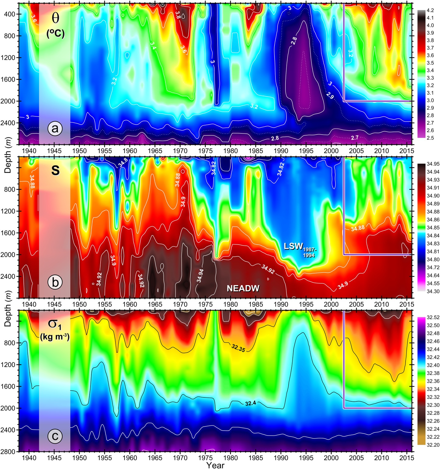
The Latest Evolution: 2024 Communications Earth & Environment Paper
Most recently, the plot appeared in 2024 in Communications Earth & Environment, a journal under the Nature publishing group. This iteration was Figure 10 in the paper and featured new added layers and improved spacing of axis titles, ensuring an optimal balance between aesthetics and data clarity. The overall layout became more poster-like, equipping readers to dive deeper into the content. Unlike some of the earlier versions of the plot, this final publication also remained free from typesetter modifications, ensuring Igor could achieve his intended design.
Advancing Technology: Tools Helping Evolve the Plot Over Time
Igor’s iconic plot has kept its relevancy for a major reason: it’s continuously evolved alongside various advancements to provide an ever-clearer picture of ocean dynamics. Over the past two decades, ocean observation technology and data visualization software have undergone a series of changes to equip scientists like Igor to analyze and create the best work possible—and that’s evident when you consider what technology could do when Igor first created his plot and what technology can do today.
From Early Manual Sampling to High-Resolution Profiles
Decades ago, measuring ocean properties was time-constrained, limited in spatial and temporal coverage, expensive, and labor-intensive. Researchers had to deploy a weighted wire from a ship, lowering instruments that collected water samples at different depths and taking point measurements of seawater temperature using reversing thermometers. This practice, pioneered by oceanographer Fridtjof Nansen over 120 years ago, remained in use for a while. But it was limited by sporadic sampling, low vertical resolution, and the logistical challenges of ship-based research.
A little before the 1970s, oceanographers started transitioning to seawater profiling and sampling, a significantly more advanced technique involving specially designed devices that could continuously record temperature and salinity as they were lowered through the water column. These tools allowed for a much more consistent look at ocean properties compared to sporadic analysis. However, even with this improvement, ship-based data collection had major gaps in time—research vessels would only collect data once a year at best, meaning long-term trends were reconstructed from relatively sparse data points.
When Igor began working on his plot, he relied primarily on these ship-based measurements, carefully combining profiles from different years to create a cohesive visualization. Fortunately, things became easier when a revolution in data collection reshaped—or rather expanded—the view of ocean changes like those depicted in Igor’s plot.
The Argo Revolution: Autonomous Ocean Monitoring
The biggest transformation in ocean data collection came with the massive introduction of profiling Argo floats in the early 2000s. These autonomous, free-drifting instruments revolutionized how scientists like Igor observed the ocean. Instead of relying solely on research vessels, Argo floats are deployed from ships, then operate independently—sinking to 1,000 meters, drifting with ocean currents for 10 days, then diving to 2,000 meters before surfacing to transmit data via satellite. Of course, some of these devices profile the ocean on a more frequent basis, but 10 days is the basic requirement to enter the standard Argo program.
Unlike ship-based measurements, which are limited to specific seasons and locations, making them quite infrequent, Argo floats collect continuous, global-scale data in real-time. Over the years, Argo technology has advanced even further, with newer models reaching depths of 5,000 meters and some profiling the ocean daily, dramatically increasing the resolution and frequency of available oceanographic data.
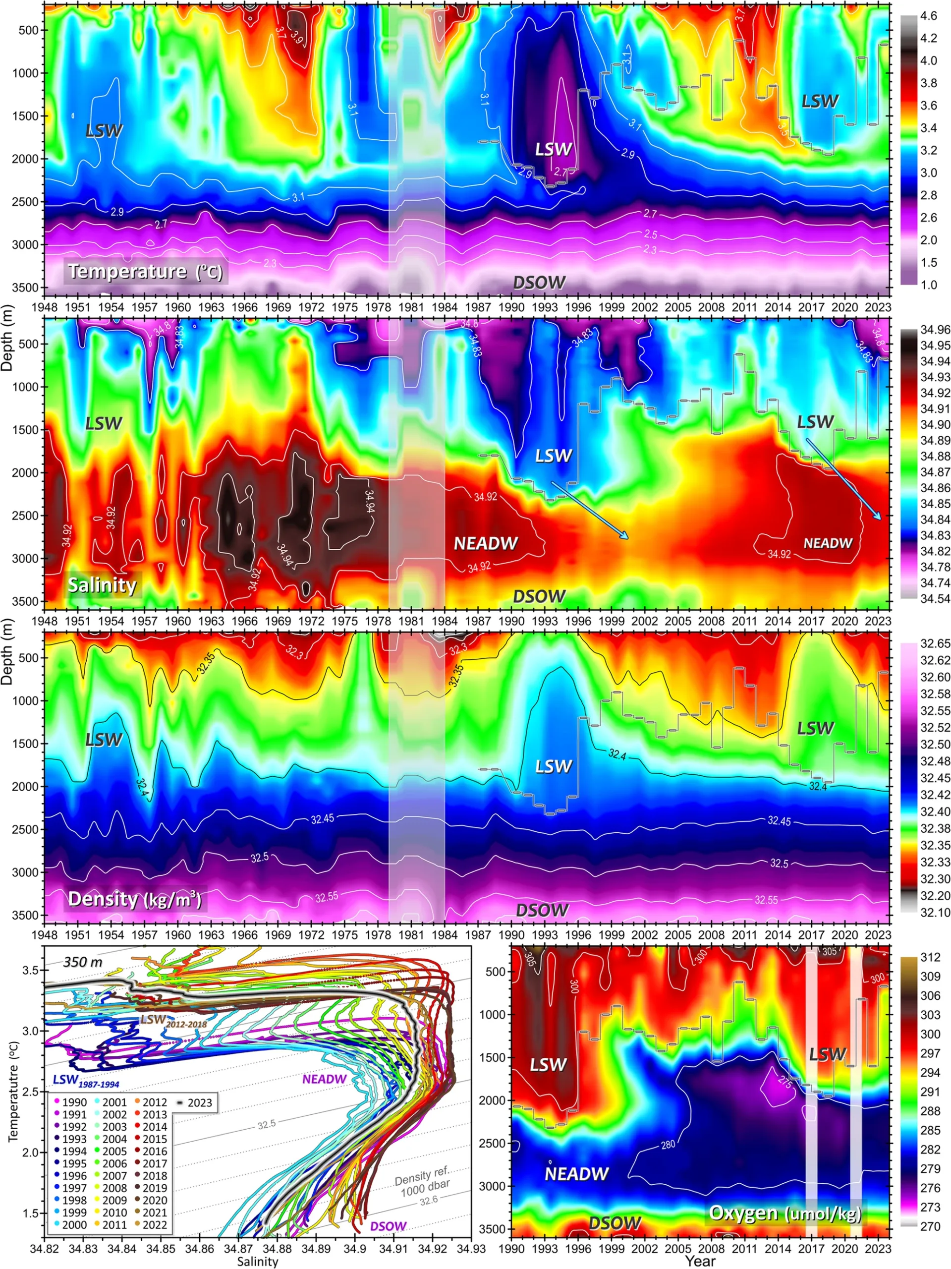
For Igor’s plot, the access to Argo float data has equipped him to expand his research from tracking year-to-year changes to also week-to-week and even day-to-day ocean variations. The recent versions of his plot take into consideration this high-frequency data, delivering a much clearer understanding of short-term fluctuations in ocean salinity, temperature, and circulation. That’s why, from 2008 onward, Igor’s papers and reports include not only long-term yearly-resolve plots but also a set of similar figures covering a shorter time period with a much higher temporal resolution.
Enhancing Visualization with Automation and Scripting
The evolution of Igor’s plot hasn’t just happened from better data collection—it’s also been shaped by advancements in data processing and visualization software. Igor uses Surfer as one of his primary visualization tools, and his workflow has evolved to incorporate the new features and improvements in the program. For example, one major feature Igor uses is Scripter, a tool in Surfer that equips him to automate his workflow while still designing a high-quality plot.
With millions of oceanographic profiles now available, manually improving his plot would be impractical. To maintain efficiency, Igor uses Scripter to jumpstart his visualization process, ensuring that every figure is generated consistently, with the same precision as if it were done by hand. He also prepares boundary and bottom layer masks in MATLAB, which allows him to define custom regions and refine graphical elements before bringing them into Surfer for final visualization.
By integrating scripting and automation, Igor has no problem enhancing his iconic plot efficiently while maintaining high accuracy and applying consistent design elements to maintain a similar feel over time.
One Plot, Decades of Discovery
What started as a simple visualization over two decades ago has grown into a scientific mainstay—a single plot that continues to evolve, inform, and inspire. Through changing technologies, improved ocean observation tools, and ever-advancing software capabilities, Igor has shown that great data visualization isn’t about flash or gimmicks—it’s about careful design and a willingness to evolve your work as things advance. With the success he’s seen with this approach so far, it’s safe to say Igor’s decades-old plot will continue to make waves in the world of oceanography and beyond.
Want to read more stories like this? Subscribe to our blog to discover interesting news and tips in the world of geoscience so you never miss out!