What is Taylor’s Power Law? (Interview with R.A.J. Taylor)
R.A.J. ‘Robin’ Taylor is an Adjunct Professor of Entomology at The Ohio State University in Wooster, Ohio. He has written a book entitled Taylor’s Power Law: Order and Pattern in Nature. To illustrate the book, Robin relied on Grapher for the creation of over 200 graphics. We had the chance to ask him a few questions about the book.
What is Taylor’s Power Law?
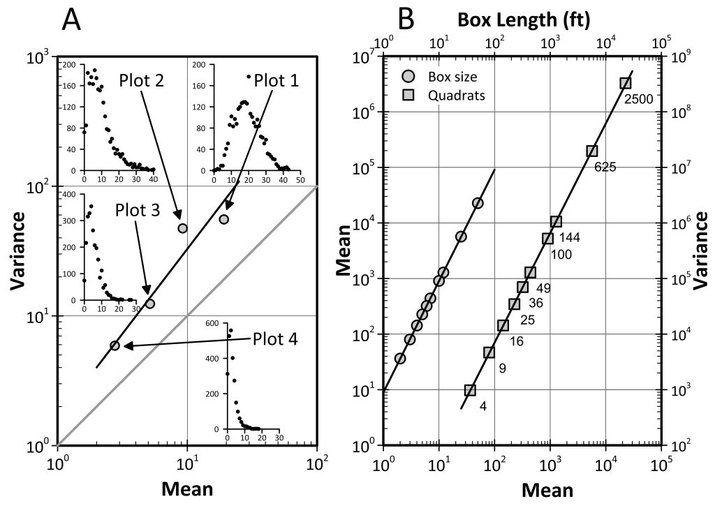
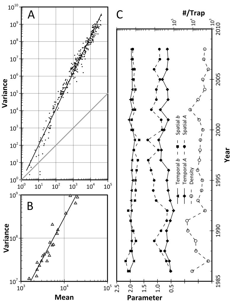
TPL is a statistical relationship relating the variance (V) of a population or process to its average value (M): V = a Mb. It is characterized by a change in the frequency distribution with changing mean (see Fig. 8.7A). The exponent (b) tends to be fairly stable in space and time, while the coefficient (a) is more variable (see Fig. 8.9C).
An example of current interest is climate warming. Although, for technical reasons temperature does not obey TPL very well, as the average temperature increases, processes like precipitation and storm events also increase in frequency and intensity, and with it their variability: TPL describes precipitation very well. The highs get higher and the lows, though less common, get lower. The increase in frequency and severity of extreme weather is described well by TPL.

FIG. 8.7 (A) Ensemble TPL of Japanese beetle larvae in 4 to 2500ft2 plots with the frequency distributions of #/ft2. (B) Right: Box counting ensemble TPL of number of larvae in 4 to 2500 ft2 quadrats. Left: mean against box length has the same slope. (Original Fleming & Baker (1936) data given to L.R. Taylor by Dr. Chester Bliss.). (From Taylor, R.A.J. (2019) Taylor’s Power Law: Order and Pattern in Nature. Copyright Elsevier 2019).

FIG. 8.9 (A) Spatial and (B) temporal TPLs of annual catches of Japanese beetle on Terceira Island, Azores, 1986–2008. (C) Time series of the parameters for intrayear spatial TPLs of JB on Terceira. The slopes are more consistent from year to year than the intercepts and the temporal parameters less variable than the spatial. The average number caught per trap in each year has varied over a factor of 10, but has generally been in decline since the 2002. (Data courtesy of the Terceira Agricultural Service.). (From Taylor, R.A.J. (2019) Taylor’s Power Law: Order and Pattern in Nature. Copyright Elsevier 2019).
What are the Benefits of Visualizing Order and Power in Nature?
TPL is a simple mathematical statement that appears to have currency in many disparate disciplines from agronomy to zoology and criminology to computer science. It is visualized as a plot of log(V) on log(M) and shows the degree of aggregation of populations and processes in space and/or time. Many processes are aggregated in space and/or time – tornado outbreaks and seismic temblors, for example. Animal and plant populations are also aggregated in space and time, so too are criminal acts and packets through routers.
What are the Practical Scientific Applications for Taylor’s Power Law?
TPL is used extensively to decide how large samples need to be in order to achieve a defined level of precision in an estimate – it is widely used in pest management decision making, for example. It is also used in statistics to help get data to conform to statistical assumptions of homoscedasticity and normality. It is used by researchers in disciplines, such as environmental risk assessment, water quality and pharmaceutical and pesticide efficacy, that rely on statistical analysis.
Why did You Choose Grapher to Create the Visualizations for the Book?
I had been using Grapher 7 for years when I started to illustrate the book. It was necessary to keep the text uniform in size, while allowing the graphic to vary in size from 1 to 10 log cycles in the abscissa (up to 20 in the ordinate). Grapher makes creating templates easier.
What Tips do You Have for Someone using Grapher to Visualize Taylor’s Power Law?
The visualization of TPL is simple – a double log plot – but Grapher enabled me to insert frequency distributions onto the double log plot in Fig. 8.7A. My advice to scientists using/visualizing TPL is they should ensure that the log(V) and log(M) scales are the same so that the equality line (the Poisson or completely random case in which the power, b=1) is 45°. Complete randomness is rare, so the equality line represents a baseline. Some people use standard deviation against mean, which has the 45° line equal to a power of 2. Many figures in the literature adopt a landscape orientation with different X and Y scales. You don’t get a good impression of the degree of aggregation with these images.
When and Where will Your Book be Available?
The book is available for purchase now. As for where, you probably won’t find it at Barnes and Noble, but large university bookstores will have it. It’s pitched to researchers, so it’s possible it might get recommended for some upper level or graduate university courses. I don’t expect it to become a course text book.
For more information on Taylor’s Power Law, visit: https://www.elsevier.com/books/taylors-power-law/taylor/978-0-12-810987-8


